


In an era of soaring user expectations, “surprise and delight” is not just a catchy phrase, but a UX and design philosophy. From playful animations to thoughtful functionality, discover how companies are leveraging this theory to set themselves apart in a crowded digital space and foster brand loyalty.
Twenty years ago, when we were getting started, putting together a beautiful website that functioned seamlessly was far from a given. You could do fewer things with code or design programs. Creating animations was complex work, and they were a bandwidth hog. Good hosting wasn’t always easy to find. Consumers had weak internet connections that made pages render slowly, and there was poor cross-browser compatibility. So, when we succeeded in launching an aesthetically pleasing, smile-inducing site back then, the applause was swift and sure.
But a lot has changed, and now it’s not too difficult to make a basic site that loads and does useful things. (Though making a great basic site that meets business requirements is still an art.) Along the way, consumer expectations have gotten sky-high.
If the basics are more easily covered, and the bar is massively raised for users, what can companies do with their websites to set them apart from the competition?
One way to elevate an experience and build a brand affinity is to deliver “surprise and delight.” You’ve probably heard it before, and it’s not just a snappy phrase, it’s a theory of UX and design.
The miraculous effects of surprise and delight
Before we get into the academic definitions, let’s put “surprise and delight” into terms nearly anyone can relate to.
Imagine a small town with five dry cleaners, all within three blocks of each other. (True story: This town does, in fact, exist.) All of them offer very similar services and pricing. You can throw a rock and hit every one of them. One cleaner, however, sets themselves apart because they know each customer by name, even when a customer hasn’t come into their store for months.
It’s not entirely clear how they accomplish this incredible feat given that they have hundreds of customers, but the effect is 100% surprise and delight. They manage to burnish their brand and create loyalty in an extremely tight field, bringing a smile to the face of all their customers – whether they are a frequent or annual shopper.
According to UX research and consulting firm Nielsen Norman Group,
User delight refers to any positive emotional effect that a user may have when interacting with a device or interface. User delight may not always be expressed outwardly, but can influence the behaviors and opinions formulated while using a website or application.
NN/g goes on to say that there are two types of delight: “surface” and “deep.”
Surface Delight
In NN/g’s definition, surface delight is “local and contextual; it is usually derived from largely isolated interface features.” In the surface category are things like animations, tactile transitions or gestural commands, microcopy (i.e. injecting humor and slang, predicting users’ questions in advance), beautiful, relevant, high-resolution imagery, and sound interactions. We polled our team, and here are some of the surface delight examples they like out in the wild.
Asana’s Celebration Creatures
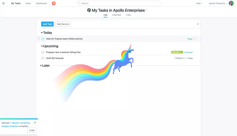
For years on end, project management tools were pretty mundane. (Much like dry cleaners, they were a necessary evil.) After all, for most of us, it’s not fun to have a ton of stuff to do – and further, to have the need to organize that stuff. But you know what is fun? Checking those things off your to-do list.
To that end, Asana artfully tapped into that joy. Enter Asana’s “Celebration Creatures” – Unicorn, Narwhal, Phoenix, Yeti, and Otter. The creatures appear (and fly off) the screen as you complete tasks. They are the PM equivalent of that purple-ink smiley face from your first-grade teacher. And, just in case the creatures rub you the wrong way, you have the option to turn them off in settings. Again, Asana is tuned in to customer needs.
Of course, the proto-Asana Creature was MailChimp’s (now retired, but always esteemed) Sweating Monkey Finger. For a marketer, pulling the trigger on any outreach campaign is stressful. There’s been all the back and forth with strategy, creative, and editorial. There’s the list selection and lots of rounds of quality assurance. At the moment the marketer is finally ready to launch the campaign, there is no getting around the stress. After all, money and brand are on the line.
MailChimp delightfully made light of that universal moment. They winked at the user and said, “We get you. You are not alone. We all feel it.” And it was a win-win because perhaps they made the user think about MailChimp one last time before they hit send.

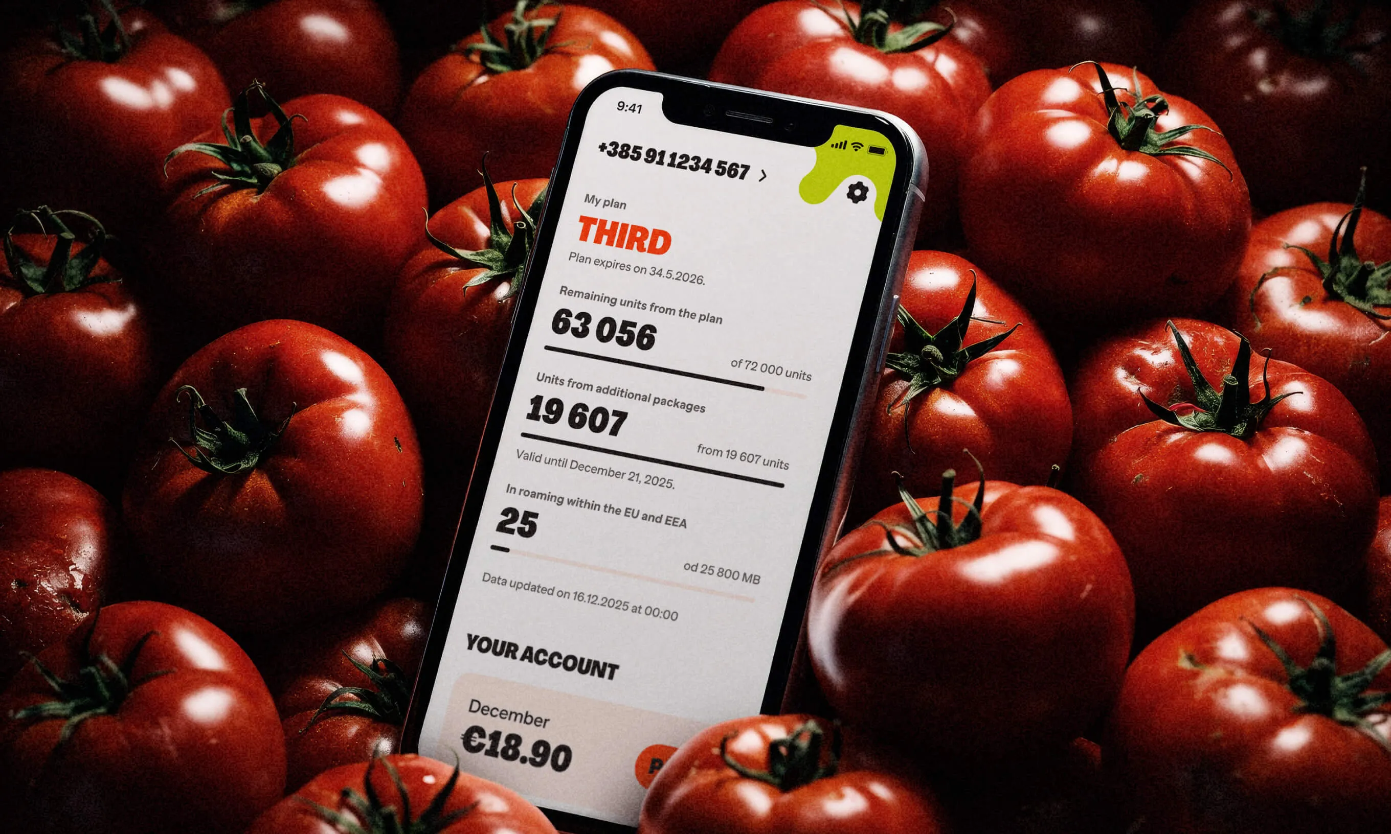
Another more recent, albeit subtle, example is the Airbnb filter page. We’ve all encountered thousands of sliders in our lives. They are an expected experience, and we know how to use them. But the Airbnb filter page adds a minor but nonetheless delightful dimension by adding a bar chart to the experience that illustrates the volume of properties at each price point. It’s clever and helpful, and it makes the user think to themselves “oh, how cool!” while generating that positive emotional effect that NN/g talks about.
In the category of microcopy, Angi’s messaging about their app upgrade is a clever play on their mission to connect homeowners to services to upkeep their residences.
Our enterprise partner Webflow isn’t just a modern no-code software and hosting company, they also are nailing surprise and delight with their microcopy. Where many sites might display a typical loading bar, Webflow shows a large dial underscored with different cheeky copy lines like “making it pop,” “responsifying,” “adding lens flares,” and so on. Like Asana and MailChimp, they’re saying “We get you. We feel your pain, and we can try to ease it a bit.”
Deep Delight
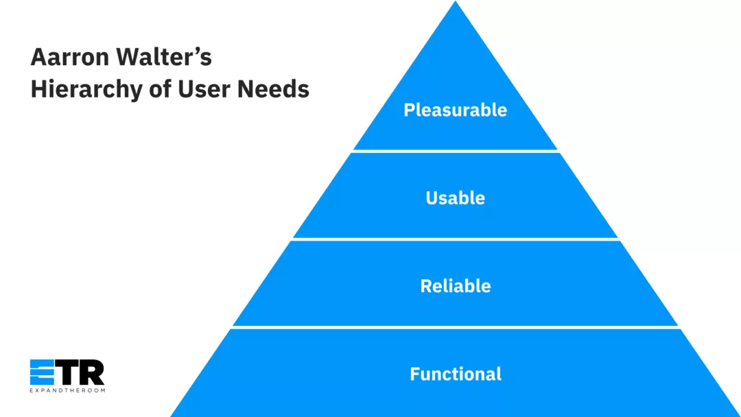
NN/g defines deep delight as holistic. “[Deep delight] is achieved once all user needs are met, including functionality, reliability, usability, and pleasurability. In other words, deep delight is experienced when the interface behaves. This state of delight, while less impressive to witness, is significantly harder to achieve. Users who experience a state of deep delight will be more likely to recommend the product or service to a friend, and to become a passionate return user.”
They point to Aarron Walter’s Hierarchy of User Needs. (We’ve included it below as a reminder.) In short, it says that while it can be tempting to want to add pleasurable bits to your experience, don’t try to apply them when you have not covered the bases on functionality, reliability, and usability.
They use the additional example of a pair of beautiful shoes that don’t fit. Without the fit, the beauty of the shoes is not fully appreciated. It might even be irritating, because the user can see what they want, but can’t actually have it for themselves.
Our Senior UX Designer Kerrin Whipple talks about deep delight in this way:
“To me, the concept of surprise and delight is best accomplished when, after all of the user’s base needs are met, the interface provides some sort of assistance that is helpful in a way the user did not anticipate. For example, I recently was reading an article about how to build a raised [planting] bed, and at the end there was a calculator where I could enter the dimensions of my space and get the exact supplies and measurement list. I got what I needed from that page and then some.”
Kerrin continues: “We try to bring in ideas for delight through user research. Rather than guessing what users might find ‘delightful’ we listen to them talk about what is important to them and start our blue sky thinking from there.”
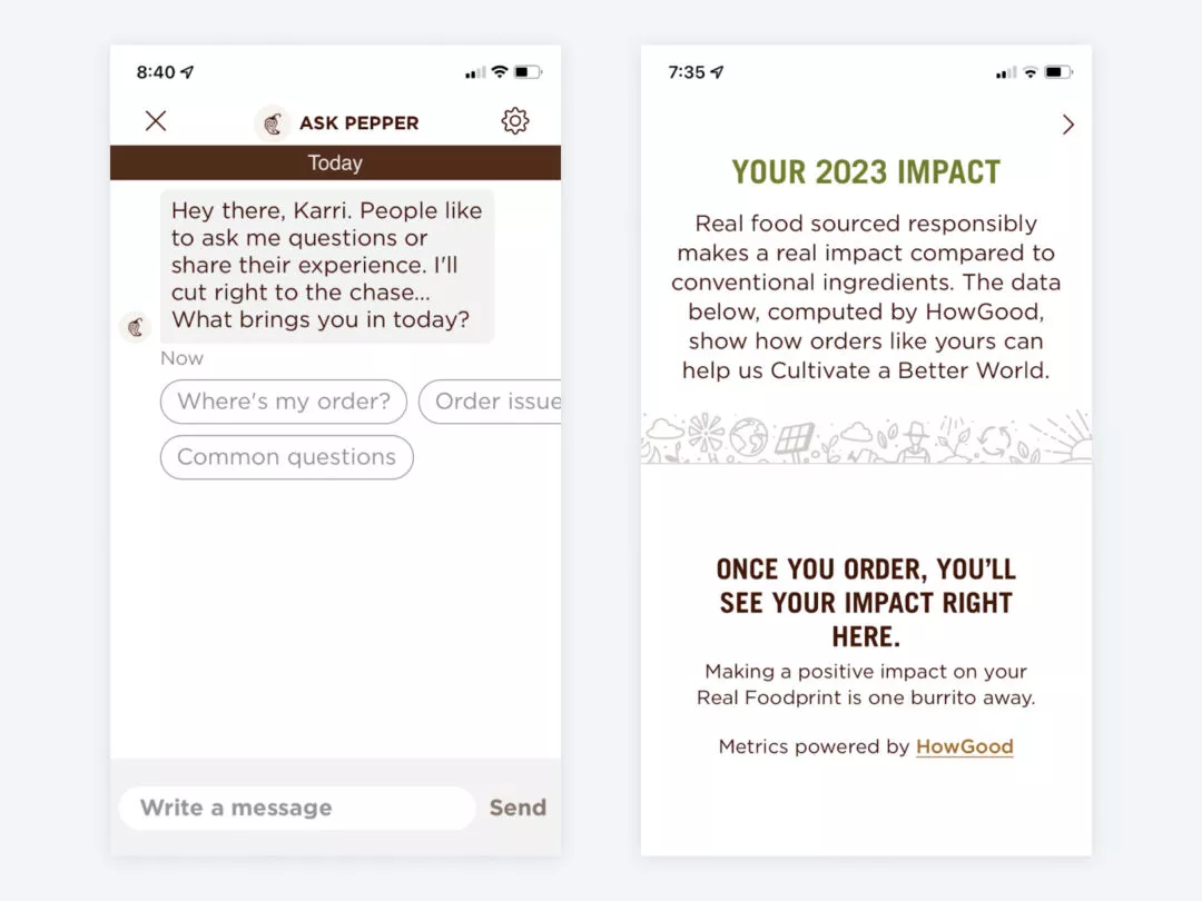
Another example of deep delight that Kerrin offers up is the Chipotle app. Like other ordering apps, it offers rewards, remembers your previous order, and more than anything, makes ordering convenient. But this app delivers delight because of its surprising features. For example, it can show you how your carbon footprint is impacted by ordering organic ingredients. (Which makes the customer feel good and reflects well on Chipotle.)
The app allows people to redeem their rewards for charity. It anticipates the group ordering that so many of us do, and allows for bill splitting. This app makes all of that possible, makes those processes easy, and they also have cute stuff like a sad avocado on an empty checkout screen and a chatbot named “Pepper.” Fresh, fast, and deeply delightful.
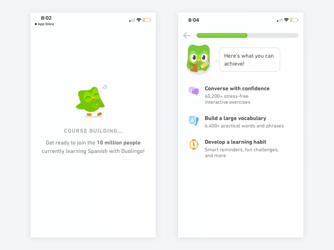
Two of our teammates also referred to the language learning program Duolingo, which stood out for having lots of delightful brand-building moments on top of an excellent and functional user experience.
During Duolingo’s onboarding, the app builds a customized course for the user that’s created in response to a brief questionnaire. A cute animated owl accompanies every page load or task completion offering words of encouragement like “way to go!!” or “almost there, you got this!!” that not only makes it fun while you wait, but feels like you have a funny friend helping you get through class.
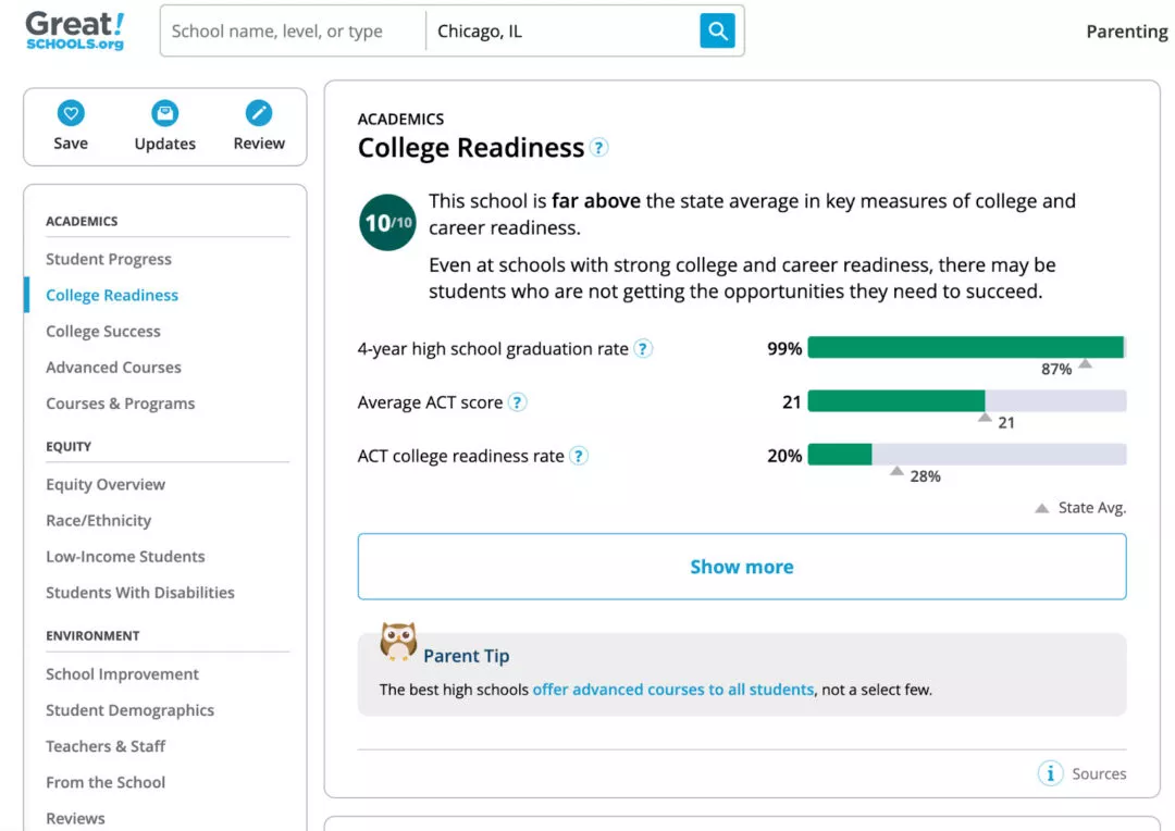
Another example of deep delight can be found with the Great School website. Great Schools is a non-profit that helps parents find the right-fit school for their kids. There is a lot of information to scroll through and each page can be long. To make that seamless, they’ve included a sticky sidebar navigation that helps you quickly jump to each section and lets you know where you are.
Aside from the breezy functionality, there are Parent Tips to offset the charts (and another owl!) making interacting with Great Schools a delight. On a site where users can be expected to spend a lot of time, this attention to detail is important to lowering barriers and keeping the user in a state of flow.
These are our four must-haves of surprise and delight:
1
Honor the hierarchy of needs. If you’re putting the surprise and delight before functionality and reliability, check yourself.
2
Be on brand. Know who you are. Further, embrace what you do and how you do it. Do not try to be Tesla when you’re Chevy. (Don’t be Harvard when you’re Duolingo.)
3
Keep it human. This is one of our guiding principles of Purpose-Driven Design. Don’t be afraid to be vulnerable and playful. Laugh at yourself, if it suits your brand. This shows a human side which can illustrate that you care and can be trusted.
4
Don’t be lulled into thinking it’s easy. Surprise and delight can feel fun and breezy in its execution, but that doesn’t mean it does not take rigor and thoughtfulness to come up with the right plan.
Our Co-Founder and Creative Director Todd Doyle sums it up like this:
“There is no shortcut or formula to creating delightful experiences. What might be delightful to one person could easily disappoint or annoy someone else. The key to resonating with your audience is to deeply empathize and understand their thoughts, concerns, and motivations.”
This article was originally published by ExpandTheRoom, a company acquired by Infinum in 2023.