When Sketch 3 finally came out and with it the great Teehan & Lax’s iOS 7 UI kit, I was really impressed with two things. How useful kits can be, and how awesome Sketch 3 is. That moved me to make something similar for Android.
People like it when they have a faster way of doing something they’ve already done once before. Like digging holes. No matter what, holes have to be dug. It’s the way things work. But in what way, fashion and how fast depends on the person doing the digging. So if you don’t want to use a shovel for the rest of your life, use your imagination and think of better ways to move dirt from point A to point B.
Developers usually work exclusively in one programming language for a specific platform. Designers, on the other hand, have to be familiar with all of the platforms by default. These are just the requirements of the job. But it’s very useful when designers who work in a team start to specialize in one particular OS. In my case, it’s Android.
We develop quite a number of Android apps, so I decided to make a UI kit tailored to the specific UI patterns of Android 5.0, following the guidelines of Google’s new UI/UX concept, the Material Design.
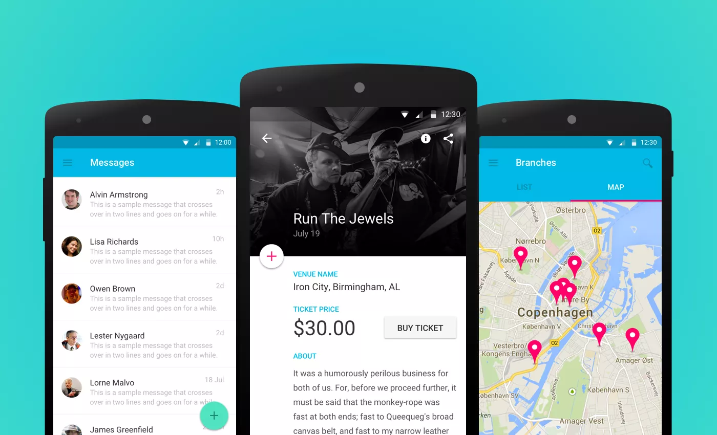
Recreating platform specific UI elements from scratch a dozen times, much like digging a hole with a shovel, builds character and deepens your understanding of the details of your work. But it definitely gets old after a while. And a UI kit works in a similar manner an excavator does. Granted, it doesn’t have that big of an impact, but it definitely speeds up the initial process so you have more time to concentrate on more important stuff at hand.
How hard was it to make this?
While making the kit, I found that it takes a lot of time, concentration and task organization to finish it. You always find new things to add, better ways of solving a problem and so on. You tinker with it till all eternity, but like with any other personal project, there comes a time when you have to decide if you are going to work on it until it’s perfect or until it’s done.
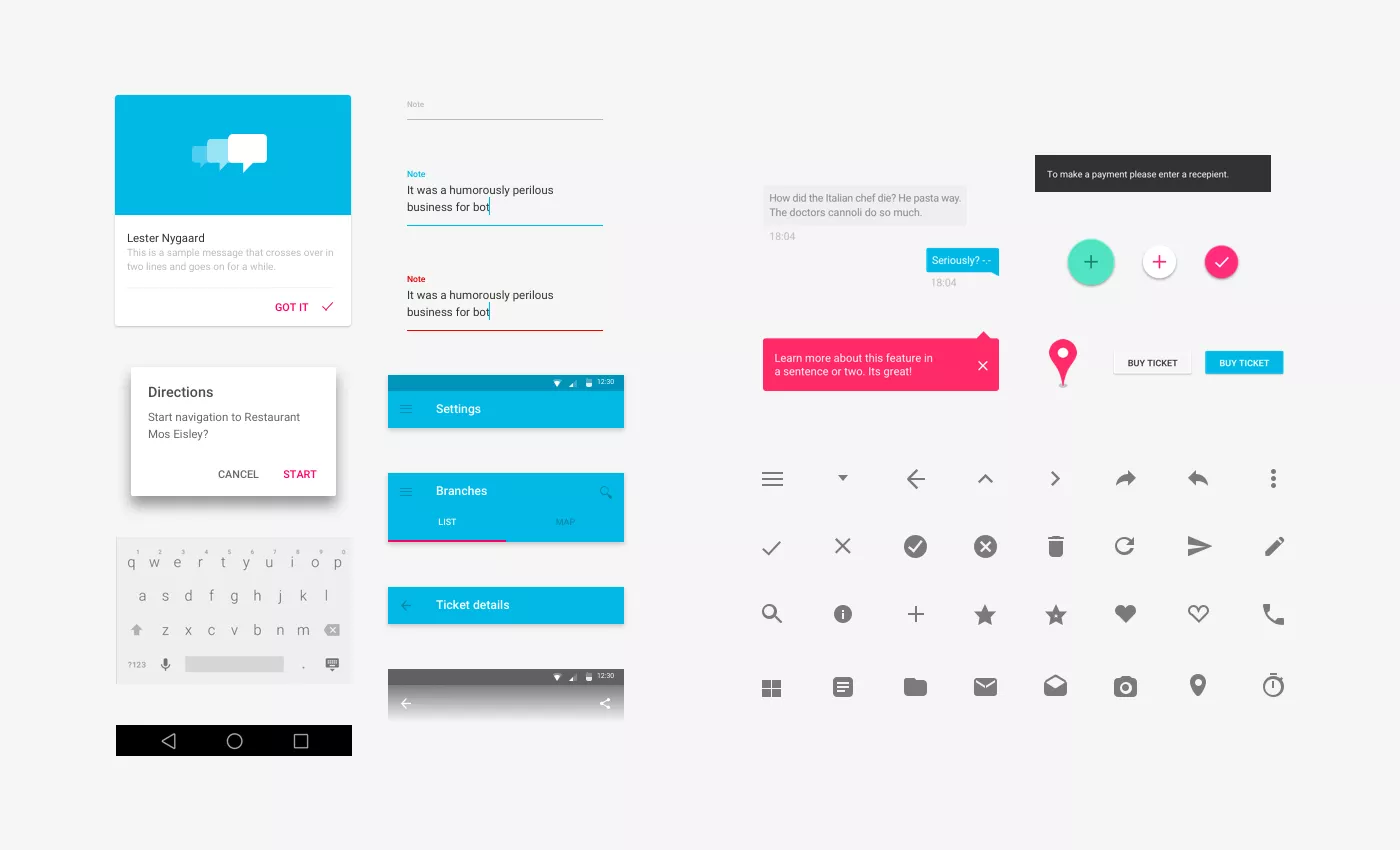
The use cases I made are based on some of the more common UX flows in Android apps. Great resources like the UX Archive, Android Niceties and Google’s Material Design guidelines also came in handy. I have to note that I mostly avoided using text styles, shape styles and symbols, as they get quite slow and buggy on bigger projects with the current version of Sketch.
You can take a look at an overview of the UI kit or download it for free.

