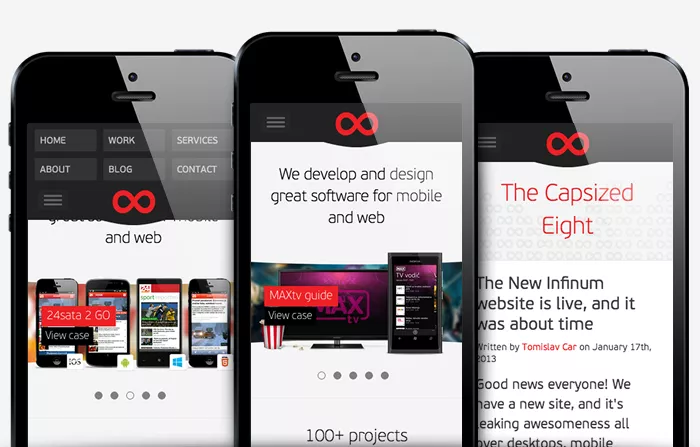
The future is here. Making our new site work properly across a variety of different mobile and tablet devices was a challenge, but one worth taking on.

Responsive web design (RWD) has been around for some time now. Analyzing the stats from our old site, we were getting around 30-40% traffic from mobile devices and this figure just kept growing. We knew we had to optimize our new site for mobile, and responsive web design was obviously the ticket.
Do you really need to optimize for mobile?
Unless you’re building a site for people who hate mobile phones, you probably want your website to have some sort of mobile-optimized presence. Maybe it’ll just be a chopped down version of your desktop site or maybe it will include all the content from the desktop site. Nevertheless, you want your mobile users to be happy.
Responsive web design or not?
In the tech community, there is a discussion going on if responsive web design is the best way of approaching mobile optimized web content, as opposed to just building a separate (http://m.yourdomain.com) mobile site. There are obvious pros and cons to both approaches.
One of the major benefits of responsive web design is that you only have to develop the website once, and the content adapts to different devices so you only have one codebase to maintain. Also, if you’re any good at it – you’re not hacking for specific mobile phones, so it’s reasonably future-proof when new devices turn up.
The arguments against using responsive web design say that if your “mobile” and “desktop” sites don’t have much in common, content gets transferred over the wire, only to be “hidden away” from the mobile user. Not to mention that you’re transferring high-res images probably intended for desktops.
Generally, adapting a very complex website layout to a responsive web design system isn’t all that easy. Same goes for adapting a website layout that wasn’t originally planned to be responsive.
Nevertheless, the pros outweigh the cons by far for a site like ours, so this seemed to be the ticket. This is also the general direction the entire industry is taking.
The Grid
Responsive websites are all about grids and breakpoints. These are design boundaries that, when used on different screen sizes, determine how your design scales and floats around.
For the responsive features we used Twitter Bootstrap minus all the components and styling rules – just using the responsive grid. Since we use it on a number of projects, we’re very familiar with Bootstrap, which was probably the main reason we went for it, although there are a lot of different responsive grids on the market.
Apart from the responsive grids, Bootstrap also has a couple of nifty CSS classes you can use to show/hide your content on different devices (.hidden-phone, .visible-phone, .hidden-tablet and so on).
Darko, our chief designer, envisioned the site as a 12 column grid layout. Designs were created in parallel for desktop and mobile. We noticed that whenever we’d abandon the mobile-first principle, we’d get screwed in the end, so the main takeaway is – do mobile first.
Target screens
The idea for the design was to have a couple of target screen sizes, for testing purposes:
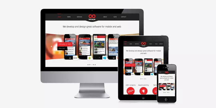
- Enormous screens – we’re talking your 27” iMacs. The maximum content area here get’s up to 1280px wide, but the screen gets wider.
- Big screens – we’re talking 980px-1280px width. The idea is that you’re just using up the safe area. The site doesn’t scale yet
- Medium screens – we’re talking 480px-980px width, your average tablets (portrait or landscape), or mobile phones in landscape orientation
- Small screens – we’re talking mobile phones here mostly. 480px or smaller
Testing for all these cases, we managed to cover most of the market for devices today.
Navigation
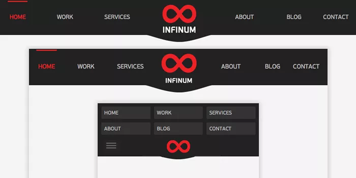
When building a RWD-enabled site, navigation is usually an area where you’ll encounter problems. For the new Infinum web, we had 2 navigation patterns – Main menu and Submenu.
For the main menu, on mobile, we used a special menu, that folds down. The menu also uses the position: absolute CSS property to stick to the top. With a bit of Javascript magic, we also get the navigation to hide so you get more screen real estate. This is how it looks:
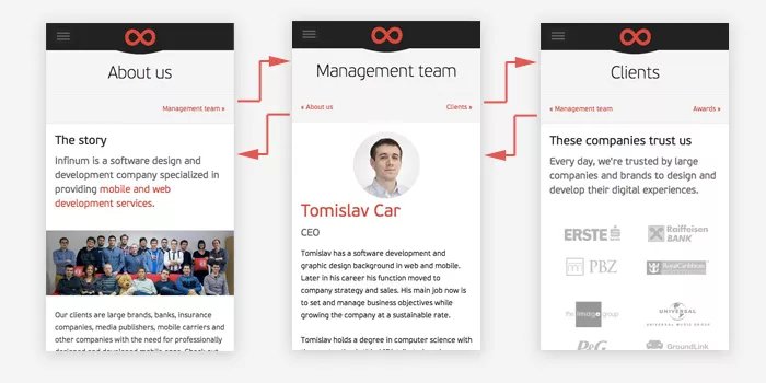
The submenu was tricky. We needed to use it, and it looked great on the desktop site, but on the mobile phone we had problems pulling it off without using a lot of screen space.
We went with the choice of breaking it down into a “wizard-like” submenu, where you’d progress through all the menu items one by one. Still not sure if this is the best choice, we’ll need to see if we can iterate on this idea.
Optimized images
I’ll talk a little bit more about this in the next article, when I talk about performance – but the general idea was that we serve different sized images for different mobile screens.
Since the website is very rich with images, this a major performance point. We decided to serve smaller-res images for mobile phones. Here’s the main image for the Monsters and pirates case, in various dimensions for various devices.
- Desktop size,
399 KB - iPhone retina size, 640x,
242 KB - iPhone 3GS size, 320x,
69 KB
All this starts to matter, especially on lower mobile network speeds, like EDGE for instance.
A helpful tool for doing responsive web design
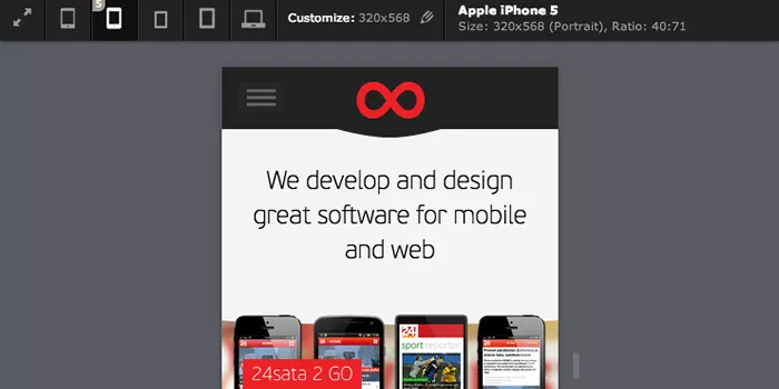
The Viewport resizer from MalteWassermann proved to be an effective tool for testing. You can quickly throw around a couple of different device formats and orientations. It’s simple and fast to use.
But alas, nothing beats testing on real devices.
People rarely turn their screens around, but they do that all the time with their phones, and especially their tablets. So, a big part of optimizing for responsive was checking if the website works fine in any screen orientation.
How much does it cost?
I actually get asked this a lot – what’s the overhead of building a responsive website, as opposed to a regular one?
Well, for building the new Infinum website, I’d say we spent around 40-50% more time than if we were to build it as a regular, desktop-only website. The majority of this time was testing and optimizing on different devices. A very big part of this was adjusting for speed.
Was it worth it?
Hellz yeah! Try our website on your mobile phone, it’s leaking awesomeness. If we never get another mobile visitor ever again, I’d still be proud at how me managed to pull the entire thing off.

