In July 2013, I had been working at Infinum for exactly 1 year and felt I learned a lot having to continuously step out of my design comfort zone. But there was another big challenge that had waited for me for 4.5 years.
I had to write my master’s thesis in graphic design and graduate from college. I quickly decided to design an app and a promotional website paired with a video and thought my worrying days were over. As an idea for the app itself proved to be elusive, I truly felt like there was a big wall in front of me.
Then it came in like a wrecking ball – my app was going to be a personal expense manager! At Infinum, we regularly work on financial apps and this partly influenced my decision. Nothing fancy and groundbreaking, but a solid idea that I was going to solve and get to the bottom of. After studying competitor apps and services, I concluded it was time for a personal expense manager that was designed well and not overburdened with excessive features. Then and there “SmartSpender” came to be – once and for all changing, in theory, the face of mobile personal finance management.

Make it or break it
I started defining the main functionalities and, after much consideration, decided on three:
- Expense tracking
- Financial stats
- A simple shopping/to-do list
Using great apps like Solidify and making the wireframes in Fireworks, the first prototype came to life. Soon issues started cropping up at a steady pace. What kind of an expense input flow would be best to use? Who is my target audience? And good grief, which font to use?!
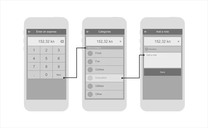
Defining everything early in the process would prove to be the key to peacefully driving the project home, considering that I had to design a website, animate a small promo video and finish the app’s design.
Testing different scenarios gave me an idea in which way to move and helped me define the critical points of my project. The input flow would be the feature that makes or breaks the app because it would be the most common use case. Therefore, in a discussion with my mentor, I decided to focus my testing exactly on that. This gave me a chance to shift some attention to the promo video, which, although being short, had to be defined scene by scene.
A brand new identity
When the two final wireframe prototypes of the app, website and the video were finished, it was time to actually add some aesthetics to that raw functionality. I had to finish the design before the project was presented in front of a bunch of anonymous testers. I started creating a visual identity that would be modern, clean and that would allow the app to stand out in the crowd. My inner art director, who was on hold, finally had a chance to do his bidding without any hovering art directors offering their unsolicited advice.
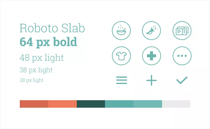
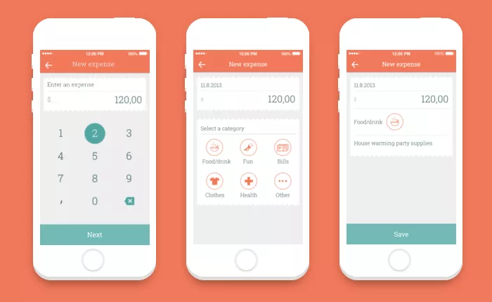
Getting the app, website and the video visually on the same page was pretty easy after completely defining the visual identity. I believe this is true for any kind of project because it provides a set of rules which make work easier for designers and developers. When I finally finished all the work, there was just the simple task of putting everything up for anonymous testers to judge.
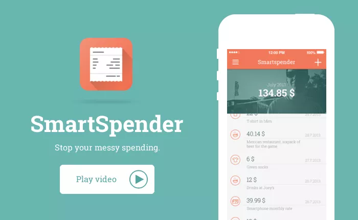
Check out the Youtube link to watch the promotional video.
A smart way to evaluate
About 2 months after starting out, I put up the final materials for A/B testing and called out for testers. The data I gathered helped me form the final conclusion of my thesis. It also confirmed my hypothesis that designing an app or anything else for that matter is done best with planning, testing, creating a visual solution and having an eye for details.
The details are not the details. They make the design.
Charles Eames
In this case, the details are in creating a good user experience, which in turn provides a good backbone for a visual solution. It means having an eye for function and aesthetics.

