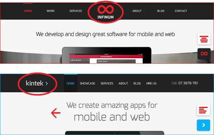
Dear Kintek, it has come to our attention that your new website is very similar to the Infinum website. And when I say “very similar”, I actually mean it’s basically a xeroxed version.
My knee-jerk reaction was to rain fire and brimstone on anyone that blatantly copies our work. After all, we spent a lot of our time (mostly over weekends) developing the website and all the fine-grained details that come with it. From the first draft to the final product, it took us over 6 months. It’s our intellectual property, and not honoring that, well frankly, pisses me off.
UPDATE In the aftermath of this article, Kintek has published a response admitting to copying our website.
Also, after poking around the Internet, we found an even earlier version of your website that’s even more similar to ours.
But after some thought, Darko, our design lead (he’s a very nice person) convinced me to give you guys the benefit of the doubt and not send the Croatian emmigration in Australia (known for working as bouncers and construction workers) knocking at your door.
Comparing notes
Anybody can make a mistake, and we understand that. What we want to do here is talk about how to improve your ripoff..ahem..website, and make it better.
Brand logo
On the Infinum website, the brand logo is centred for a reason – because all the other primary content items on the page are also centered. The logo in your navigation is left aligned, so other elements should also be aligned left, for consistency sakes.

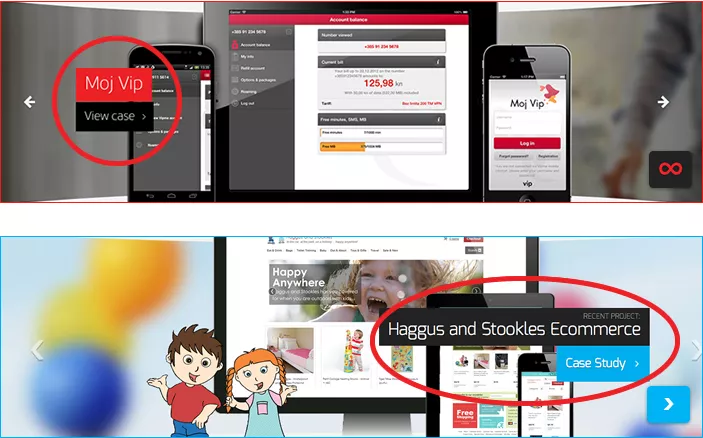
Alignment
The case details on the main slider could be positioned right (although it’s not the best solution), but all the text sholud be aligned left for better readability. You’re probably targeting western markets (like ours) that typically read from left to right.
Embedded message in the HTML
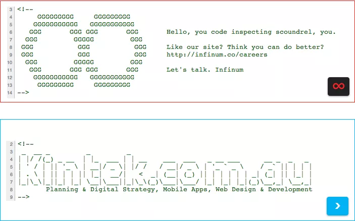
The reason we embedded a message in the HTML isn’t just to be cool. We want to target developers, potential hires, people that typically go around browsing the source code of websites that they like (that’s the kind of people we like hiring).
Just placing your marketing copy in the source code HTML isn’t going to do you much good.
Content size
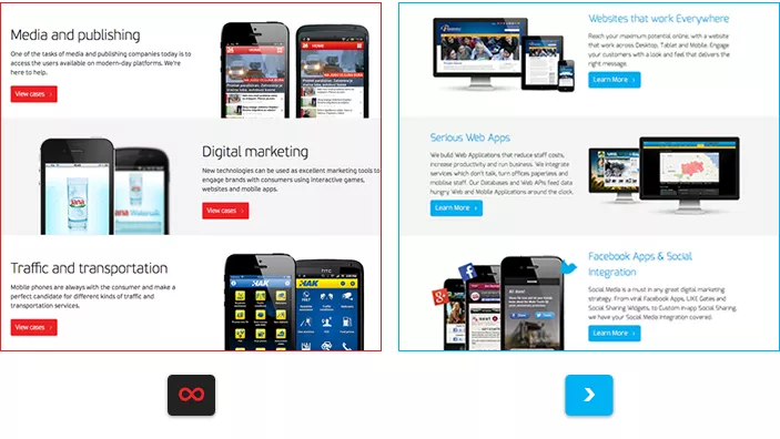
We carefully drafted out the description here for each element to be exactly 3 lines long to make the whole thing visually work. You went overboard on a couple of elements (5 lines) so the padding is a little contrived.
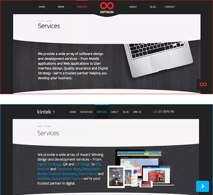
Services
The blue links here, they just make my eyes hurt.
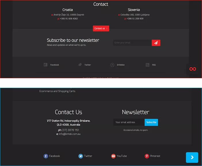
Footer
The footer is actually relatively decent, although a couple elements should be worked around (mainly the “What we do” section where you mix services, specifics and blog posts.
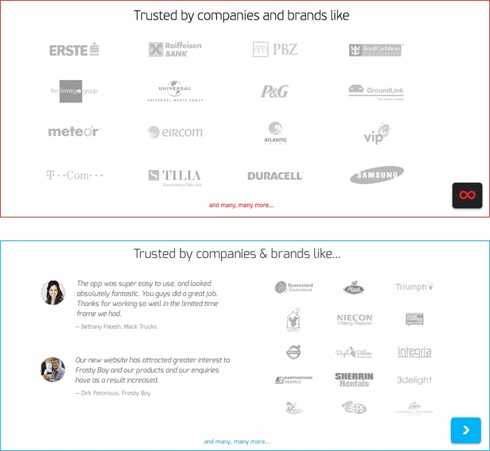
Client list
You should probably link your client logotypes to their respective websites. If they don’t have website at least to Wikipedia or something.
Imitation is the sincerest form of flattery
In a way, we’re actually flattered. Yeah, I actually have this stupid
Damn, we built a website so awesome, someone had to steal it
grin on my face the entire morning so thanks for that.
Where is Croatia anyway?
Well, we can’t actually blame you thinking you could get away with this. You’ve probably never even heard of Croatia (unless you know of Davor Šuker or Siniša Vuco).
We know you probably think we’re a third world country without electricity and running water, and that we all look like this:

When actually, we have all of that, awesome Internet access, great food, kickass designers and developers, and look like this:

In any way, it’s not very prudent to piss off people from the Balkans. Here, people actually kill bears with their bare hands.
Copying is not inspiration
On a more serious note. Pablo Picasso said the famous words:
Good artists copy, great artists steal
But you shouldn’t take that all too literally though. Inspiration is one thing – it happens all the time, especially in the design world. But there is a very obvious line between copying and inspiration.
Copying is not good for your business
You’re a software consulting agency, like us. Apart from being unethical, copying just isn’t good for your business long-term. The biggest asset your agency has is the reputation, the brand value, the good name your company has, or will have in the future.
You don’t want to jeopardise that with hare-brained schemes like this. Invest some money, hire a designer. Hell, we’ll even help you out with advice, contact us, cause this is what we do.
Just don’t go around stealing other people’s work. Hope we can resolve this peacefully, and if you’re ever in Croatia, we’ll even buy you a beer.
Integrity
Like Chris, your General Manager says about himself on your website:
What’s important to him? Integrity to oneself and integrity towards others.
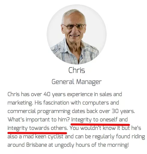
And I couldn’t agree more.


