


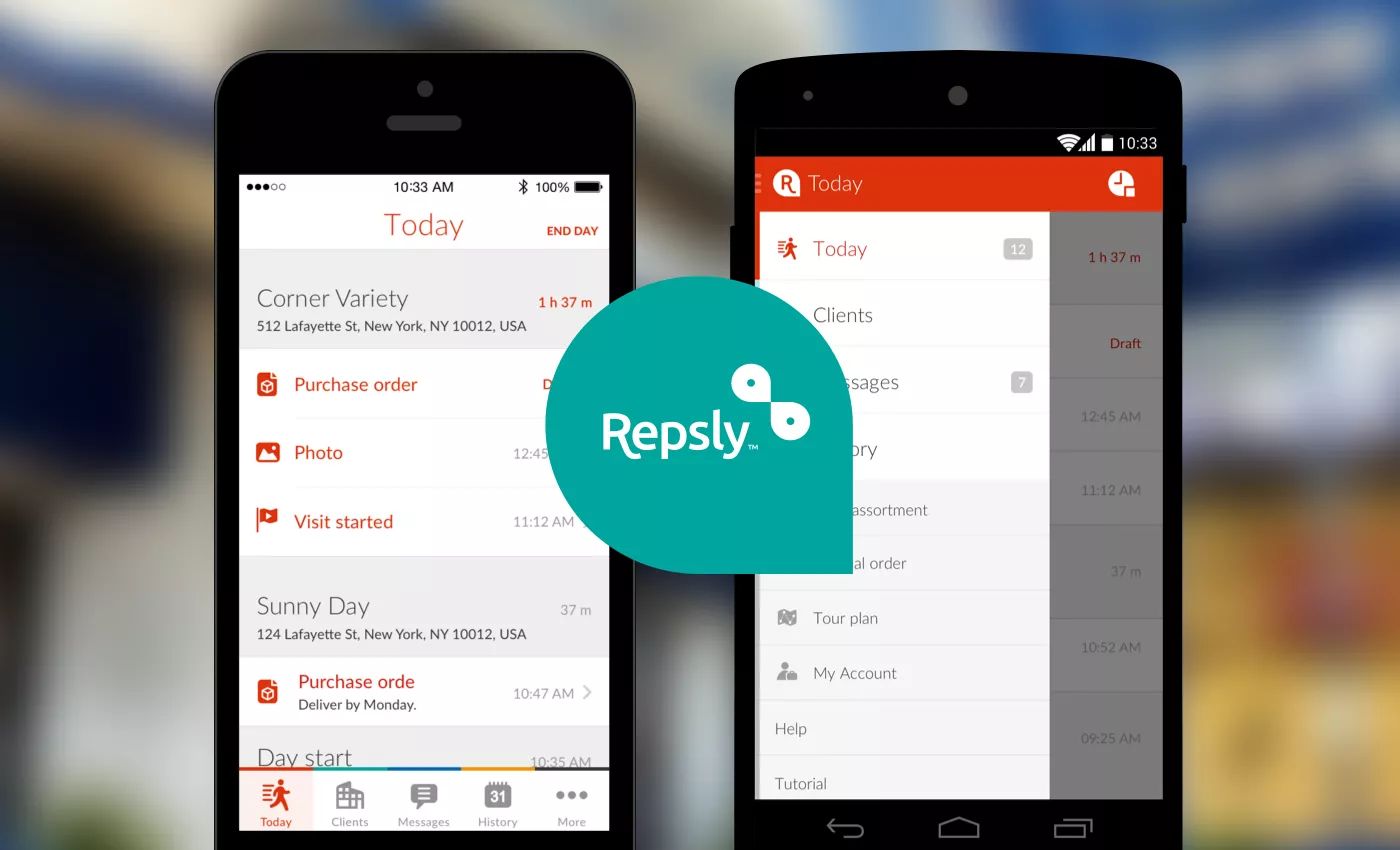
Since its inception in 2010, Repsly has been providing solutions for field activity management. In keeping with the recent rebranding, we helped re-imagine the user experience of Repsly’s mobile apps, as well as redesign their user interface.
Repsly is a company focused on providing mobile software solutions for enhancing field activity management. With its solutions, Repsly targets companies with field reps who visit established clients on a recurring basis to carry out customer service and field management activities – sales, merchandising, marketing, maintenance, etc.
The thing is, Repsly was not always Repsly. The company initially offered only solutions for field sales reps and was called SalesPod. Rapid growth (the user base quadrupled during the last year) and steady addition of features made Repsly outgrow its former brand. Thus, the management opted for rebranding to something more suitable. The rebranding, including a new visual identity and more, was conducted by Fiktiv.
At the same time, existing mobile apps for Android and iOS had a hard time keeping up with new use scenarios, that called for an extensive user experience overhaul coupled with a visual redesign. Trusting our UX expertise, Repsly hired us to handle this part of their brand transformation.
Update: Last month, Repsly raised a $1.25M investment to boost further growth. Congratulations to the whole team!
Restructuring the app
1. Use scenarios
Repsly’s adaptability translates into a large number of use scenarios, ranging from sales, merchandising and maintenance to mystery shopping. Covering all use scenarios in reality means keeping an open discussion with the clients around the world on how the apps are being used in the field work. In other words, Repsly’s team acted as a communications hub that we tapped to unveil what various clients expect from the redesigned mobile app.
2. Parting with the past
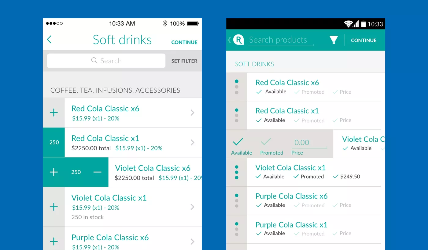
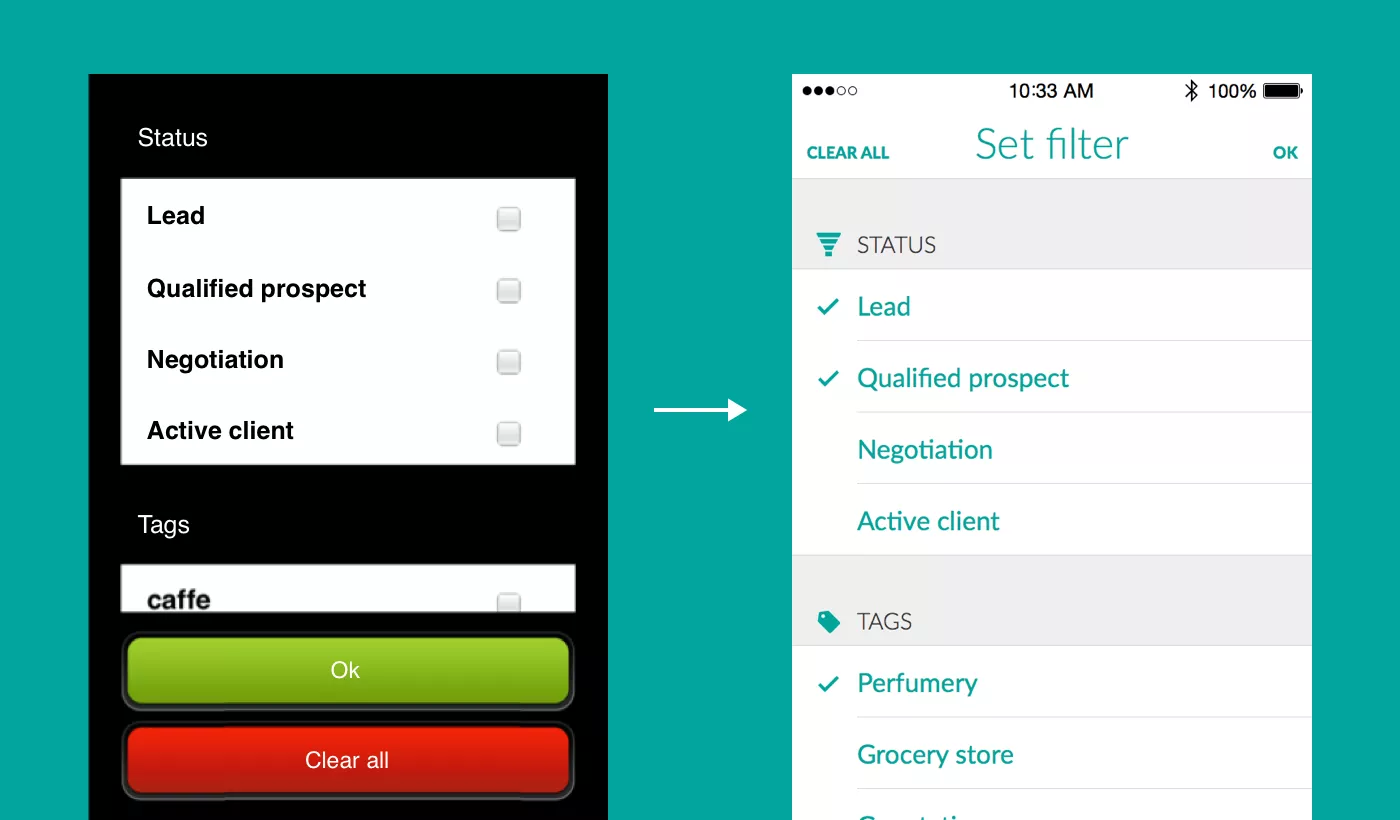
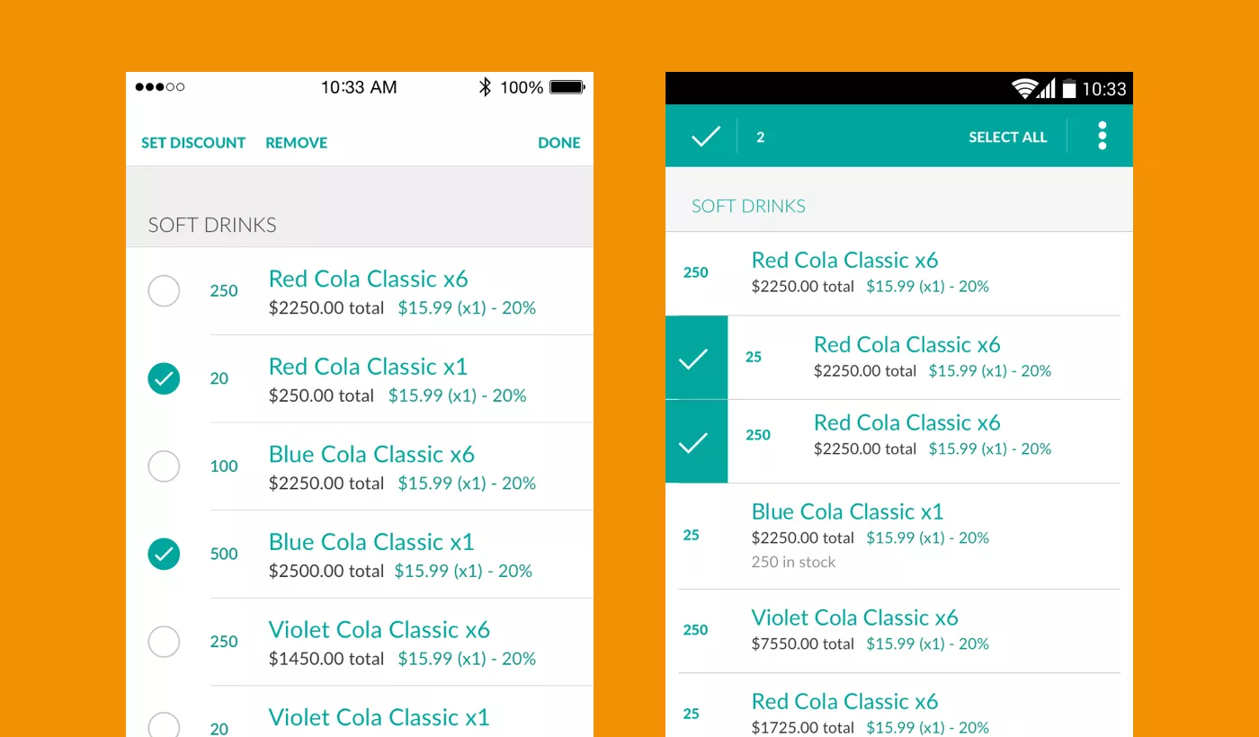
Repsly already had a fully functional app, enabling users to get things done. However, old metaphors used in the app were hard to learn and often ambiguous; What is a diary? Can I write in the diary, or is it read-only? Or should I expect time-tracking functionality in the diary?
We parted with old metaphors such as office, journal, client card, etc., and replaced them with metaphors such as feed, messages and history, that are familiar from the other apps users likely had used before.
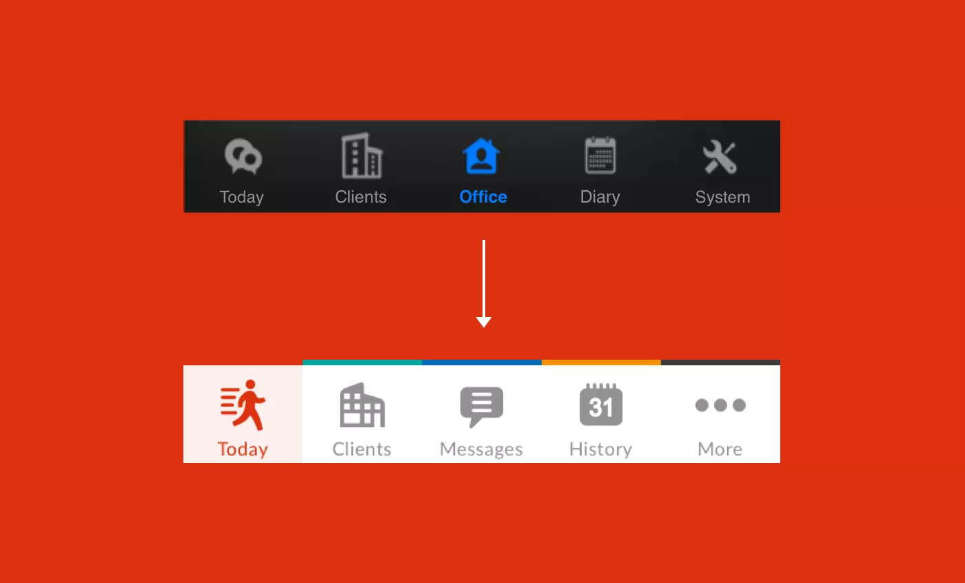
Based on usage patterns and the input from Repsly’s clients, we took the existing application apart and reassembled it again using familiar metaphors, mindful of how users really work.
3. Heuristic examination
Jakob Nielsen defines heuristic evaluation as:
examining the interface and judging its compliance with recognized usability principles
Closing in on the details, a thorough examination of each action flow and each interface element was conducted. “What is the best UX pattern to apply in a particular case? How does it carry across platforms and devices? Are we achieving an internal consistency within the app?”
4. Platform authenticity
In a similar way, utmost care was taken to stay consistent with each platform (iOS and Android). It takes effort and contemplation to pinpoint the design elements that are inherent to the character of the application, but at the same time avoid pitfalls of imposing on the design language of the base platform.
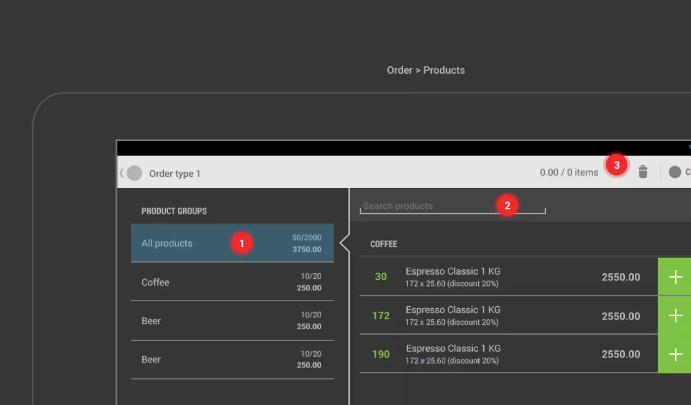
5. Support for tablets
With Repsly being a field tool, great tablet experience was of paramount importance . That’s why we created both iOS and Android tablet versions, with both portrait and landscape orientations accounted for. Creating consistency across devices required thinking in terms of split-screens, pop-overs and flexible layouts.
Result
Industrial designer Henry Dreyfuss noted:
If people are made safer, more comfortable, more eager to purchase, more efficient – or just plain happier – by contact with the product, then the designer has succeeded.
The result of our effort is a more streamlined, easier to use, and more enjoyable app. Creating a better user experience for Repsly quite directly translates into helping people get their work done. And there is a great deal of satisfaction in that.
More examples of our work, be it development or design, can be found in the Work section.