As a developer, understanding the fundamentals of the design tools used within your team is an essential skill. The notorious war between developers and designers is never-ending and design tools are the places where these two worlds collide. This raises the importance of using good design tools which provide a nice connection between the design and development process. Imagine if all the screen designs, components, different assets were stored on Google Drive and the review process and communication were handled through email/Slack. To get a single component, you'll have to go through several folders and then, you'll have to open your email/Slack to remind yourself about the discussions you had regarding the implementation. This isn't a big deal if you have to do it once a day, however, this is a continuous and frequent process. Eventually, the project grows, new designs are requested, new folders and files are added and all of a sudden, handling designs like this sounds like a nightmare, right?

Figma is a cloud-based design tool which provides simple, effective and intuitive functionalities perfect for team collaboration. Similar to Google Docs, team members can easily communicate, collaborate and edit the same file in Figma in real-time.
Benefits of using Figma
- Simple and intuitive
Most of us are already very familiar with using tools like Google Docs and Figma isn't much different from that. First-time Figma users can get quickly adjusted to using Figma and it won't take them too long to understand most of its functionalities.
- Easier team collaboration and communication
Communication and collaboration within Figma are extremely easy and convenient since Figma allows you to leave comments on the designs. Discussions can be opened in the comment thread and if you have the right permissions for it, you could also @mention certain people in order to get a faster response from the discussion-relevant team members.
- Everything you need is in one place
Screen designs, components, assets, styles, comments, discussions and so much more can be found within a single Figma file. No need to include any third-party tools (unless the team feels like they would benefit from them), so basically, for all UI-related stuff, you can refer to the Figma file. You want it, you open Figma, you got it, no further actions needed. :)
- Platform flexibility
If your device has a web browser, you are most likely ready to use Figma straight away. Figma handles rendering by using WebGL (Web Graphics Library) which has very low graphical requirements, thus, it runs well on most browsers (here's a link with more information about the browser requirements). You can share, open and edit Figma files through your web browser without any additional setup. The universality of Figma means that the design work will be available to everyone, despite the platform they are using.
- Flexible user permissions management
Each person can have either view or edit access to the Figma files. Additionally, the admin and owner roles can be set accordingly. All permissions can be easily managed and customized as desired. For a more detailed description about Figma team permissions and what different access modes entail, check out the following link.
Figma essentials
Let's take a look at some of the things which you'll probably be using very frequently as a developer.
Frames
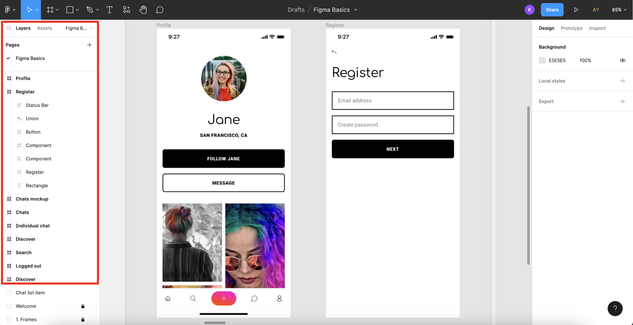
Frames serve as top-level containers for most elements in Figma. Usually, each screen has a separate frame and they are all listed on the left side as shown in the image above. In this example project, the frames are located in the Layers tab, however, keep in mind that this is customizable and the tab naming in your project might differ from this project's conventions (for example, you might have a Pages tab rather than a Layers tab). What's important is to know the fundamentals and what Figma provides as functionalities and then, minor things like naming conventions and ways of structuring stuff within the team are easily manageable.
Each frame can be expanded and its sub-frames and elements will be shown as in the Register frame on the image above. You can click around and explore what each frame consists of. You can select a particular frame or an element from the frame directly on the design canvas as well.
Element selection, code inspection, layout measurements and constraints
If you want to get more details about a certain element/component/part of the design, you can select it and then check out its details on the right side of the Figma file.
Here's an example when the "NEXT" button from the Register screen is selected:
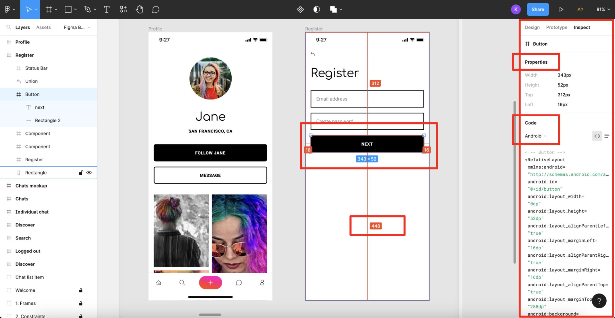
In the Inspect tab on the right side, there is a Properties section which has some basic information about the dimensions of the selected element. In the Code section, there is a small code snippet which can be used as a guideline for implementing the design in code. Feel free to copy-paste parts of these code snippets into your project, however, don't just rely blindly on them. Make sure to modify and adjust the code accordingly to preserve the project's theming and styling requirements. This section's drop-down menu has three options: CSS, Android and iOS where you can choose how the code snippets will be displayed. In this image, Android is selected as the preferred platform (a very objective and definitely unbiased choice :D). Depending on the selected element, more sections might be present in this Inspect tab, such as sections with information about Colors, Borders, Typography, etc. If you hover around the designs and have the button selected, you can see some lines which represent its constraints. You can also view the margins, spacing and other dimensions by hovering over particular regions in the designs.
Exports
In the Figma files for the project you'll be working on, there will probably be an Export tab on the right side as well when a certain element/component is selected. If you have edit access, you'll have the Export section in the Design tab, however, for developers, it is usually enough to have only view access to the Figma files.
The Export tab will look something like this (there are also images from several options provided in this tab which will be discussed below):
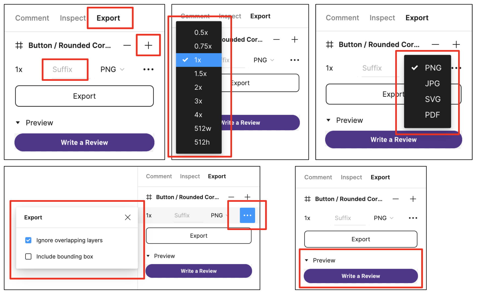
In the Export tab, the default export size is 1x and when you click on it, a drop-down list with more options is displayed. You can also write the suffix which you would like the exported file to have and choose the image format of the export. Additionally, there is an option to set some extra settings if you click on the three dots placed after the image format. If you click on the "+" button, you can export multiple files at once (you can set different settings for each of the exported files). The Preview section lets you see how the exported file will look like after the export. Here's a link to a nice guide for exports in Figma.
If you have to export an icon or some component/image which needs to be used in a vector-like form, in general, you should do the export in
the svg format and then import the file as a vector/xml drawable in Android Studio. On the other hand, if you need to export something
which is used as a normal photo or the component/image is quite complex, it would be more suitable to do the export in the png or jpg
format in multiple sizes: hdpi, mdpi, xhdpi, xxhdpi, xxxhdpi, etc. Here's
a link to a really useful utility plugin
that applies the export settings for different pixel density sizes on Android. After you have successfully exported and placed these files
in their corresponding drawable folders, the last step would be to convert them to the webp format in Android Studio.
Comments and discussions
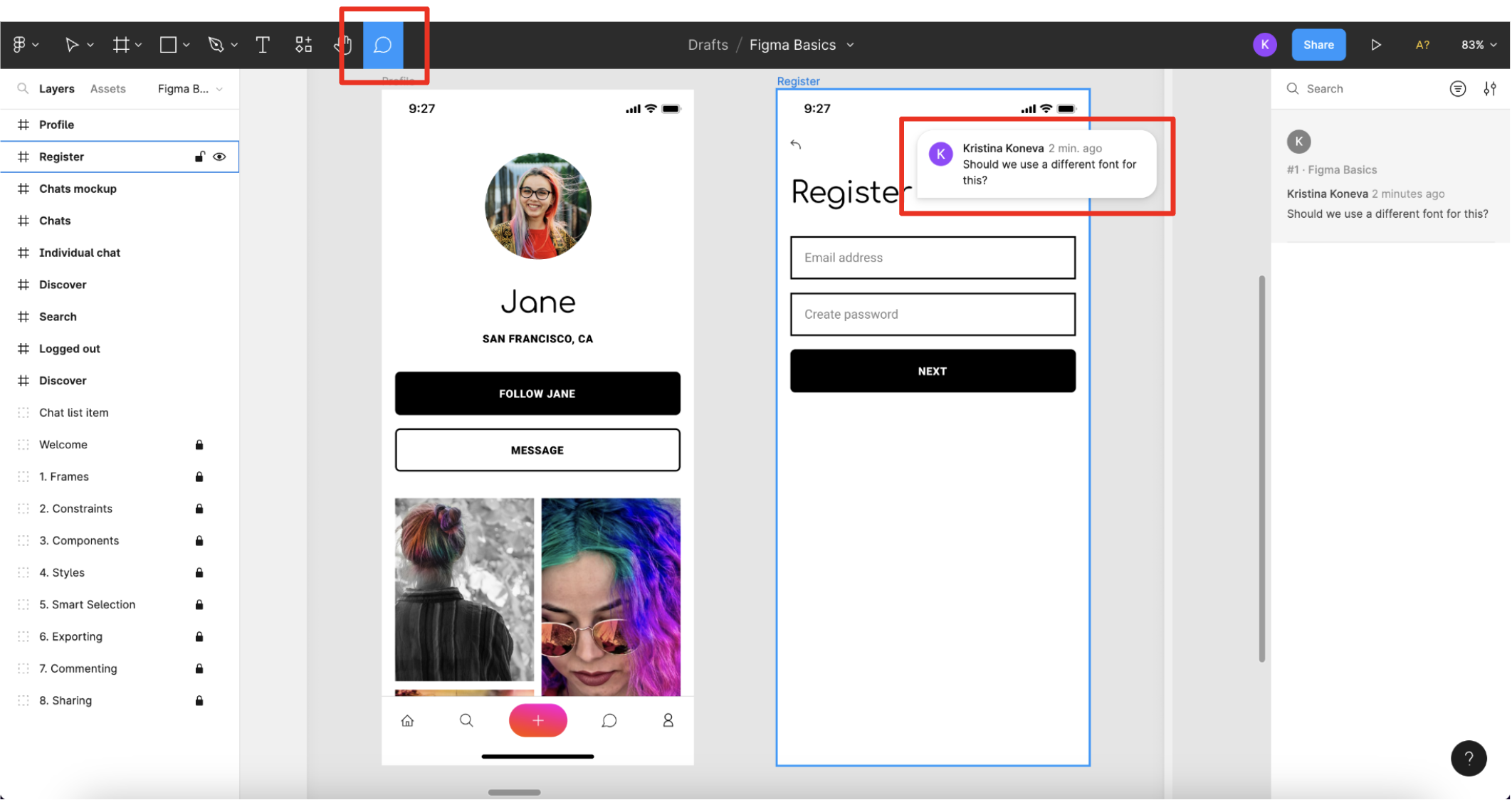
You can enter Comment mode by clicking on the Comment icon in the toolbar. As long as you are in Comment mode, you can add a comment anywhere on the canvas by clicking on the spot where you want it to be added.
Other team members can join in the discussion by replying to the comment and as it was mentioned before, you can @mention other team members in the comments. You can also resolve the comment thread once the discussion is done.
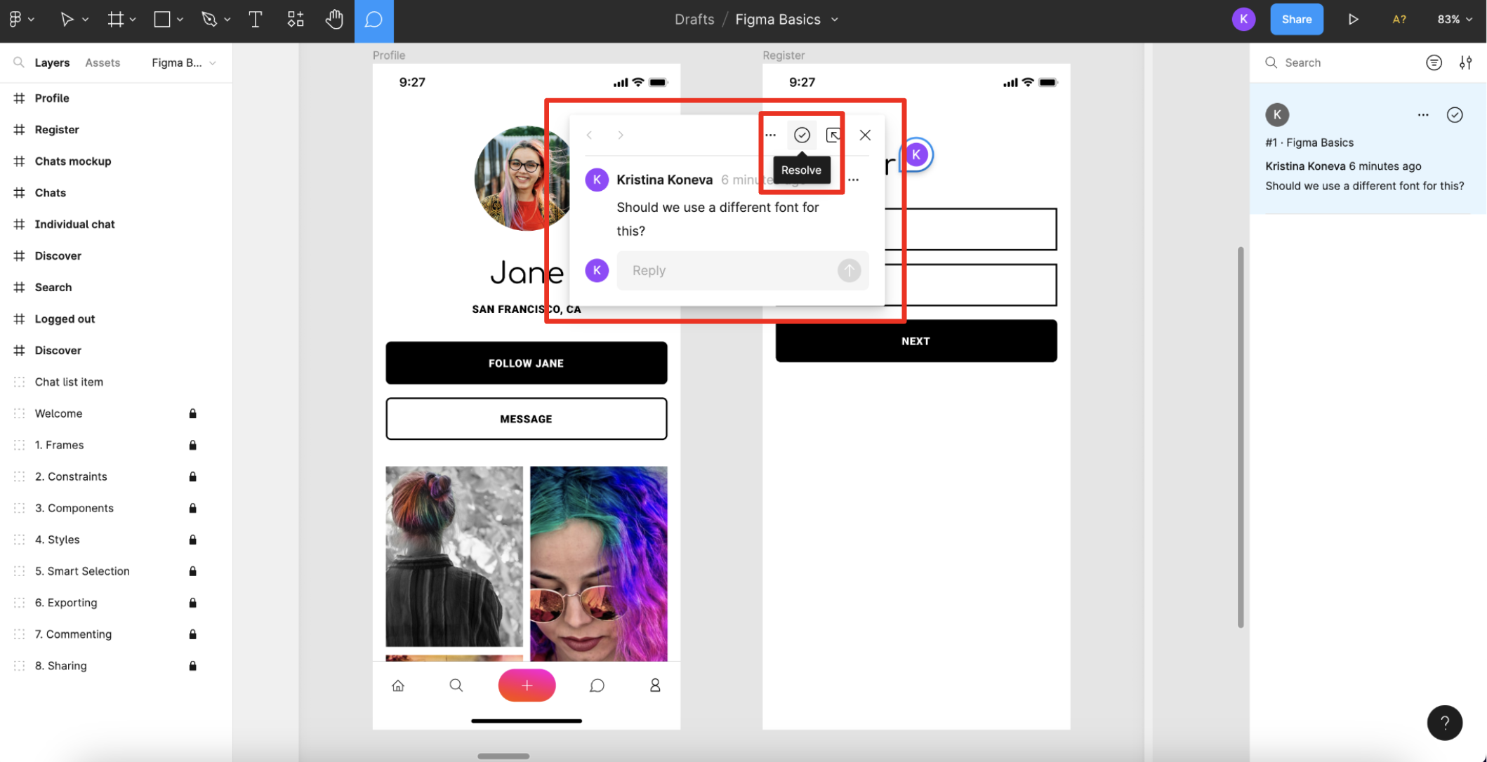
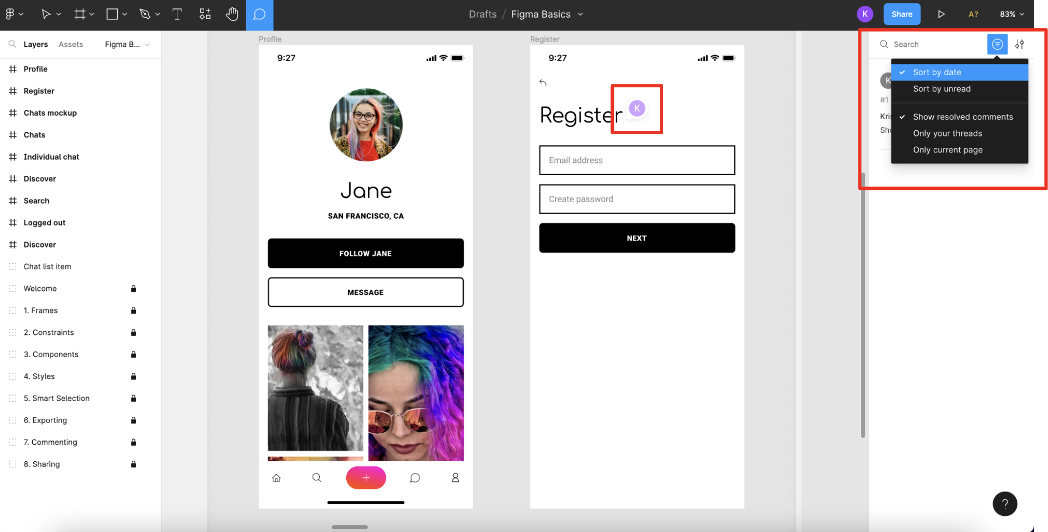
When a comment is resolved, by default, it will no longer appear on the canvas. However, you can customize this and some other settings in the options menu shown in the image below:
Version history
If you want to see a nice timeline of the changes made within the Figma file, you can view the version history in the following way:
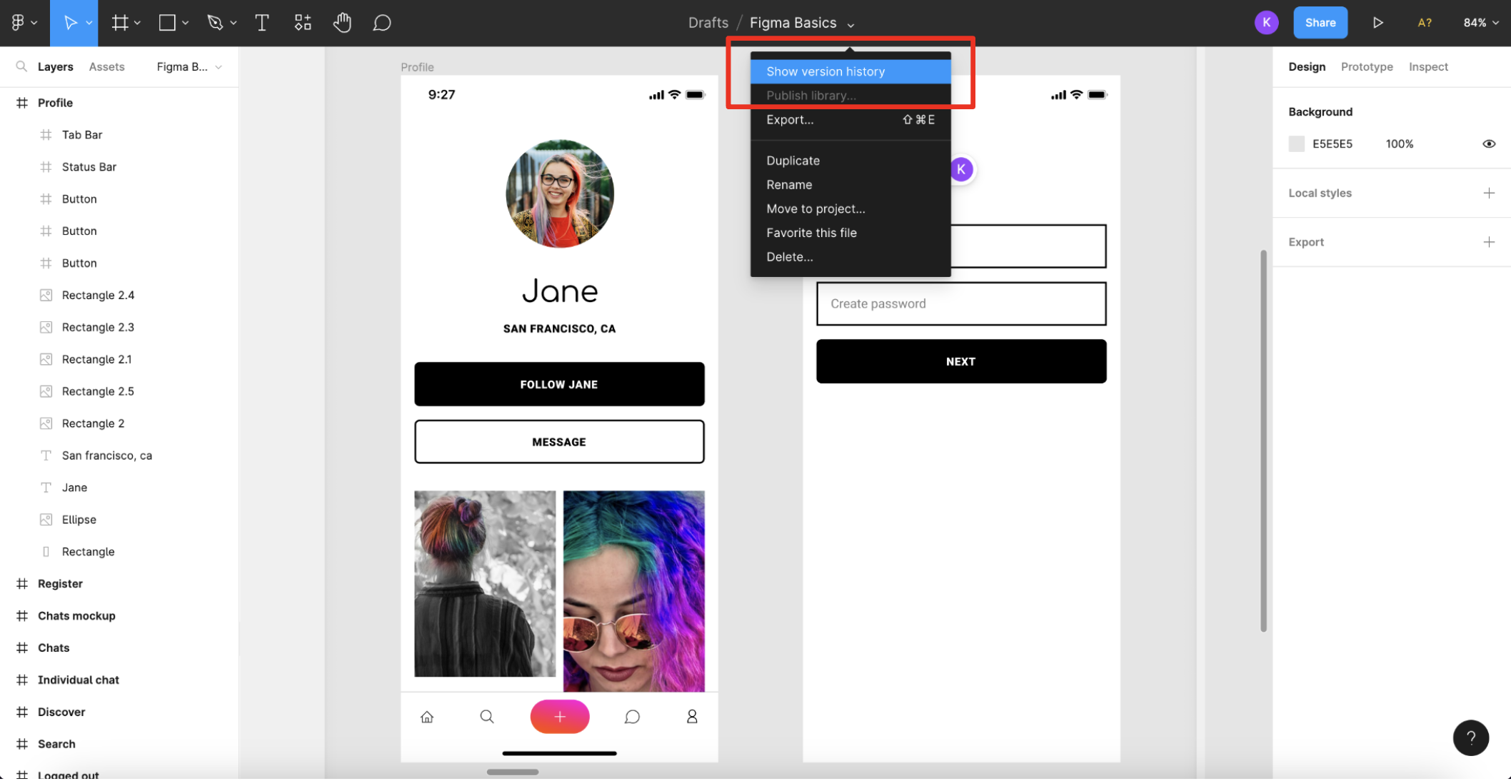
The version history will be displayed in your right sidebar in Figma.
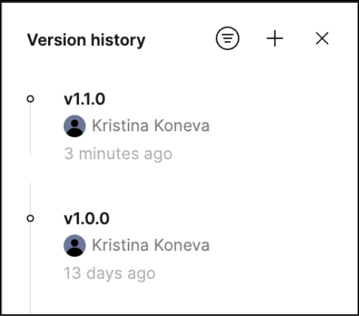
Designers will often make new changes to the Figma file and they might start working on the designs for a new version of the app while you are still developing the previous one. Therefore, being able to view the file's version history and choose at which point in time you wish to go back, leads to lots of working flexibility between teams.
When designers modify the Figma file, Figma automatically adds checkpoints to the file's version history. Additionally, the editors of the file can create and name new versions if they need to capture a specific snapshot in time. This is a really convenient way of keeping track of each file version, however, this is something the designers handle on their side, so it might differ from project to project.
Useful links