


Brand guidelines
BRAND ETHOS
You were born to create – build something new. Challenge yourself, and enjoy what you do. Be the best that you can be. Leave your ego at the door. Achieve what they never thought was possible before. Support others, hold their ladder to the top, shape the future and
neverstop.
BRAND ETHOS
Shape the future
Challenge yourself
Support others
Forget your ego
Enjoy your work
TONE OF VOICE
Inspiring, not pushy
Techy, not geeky
Relaxed, not unprofessional
Confident, not arrogant
Deep, not philosophical
Logo
The logo consists of the logomark (symbol) and the logotype (text). You can’t go wrong with using this logo, and it should be your go-to option for regular use. In specific design contexts, designers will use the logomark and logotype separately.
DO’S AND DON’TS
Don’t use the red logo on black backgrounds
Don’t use the black logo on red backgrounds
Don’t outline the logo
Use the white logo on black backgrounds
Use the white logo on red backgrounds
Use the solid logo
Typography
Neue Haas Grotesk Display & Text is our primary type family. The Helvetica we see today in the digital world is not the same as the original, pre-digital Helvetica. Throughout the years, many font details have been lost due to tweaking for different typesetting technologies. Since Neue Haas Grotesk was Helvetica’s original name, type designer Christian Schwartz has attempted to bring back the original Helvetica typeface, too – and to finally set history right.
Hierarchy
We use the display style for headlines and large paragraphs. Make sure you use it only in large point sizes because it is not as readable in smaller sizes.
We use the text style for smaller point sizes and body text. Excellent font interpolation ensures good readability in smaller sizes.
H1
Display
Bold
120 / 118px
-2.5%
Infinum
H2
Display
Bold
80 / 82px
-1%
We build digital products
H3
Display
Bold
52 / 58px
-0.5%
We’re always looking for great people!
36
Text
Bold, Roman
36 / 42px
-0.5%
We’re always looking for great people! If you fit that description, check out our open positions and apply today!
24
Text
Bold, Roman
24 / 32px
0%
We’re always looking for great people! If you fit that description, check out our open positions and apply today!
20
Text
Roman
20 / 30px
0%
We’re always looking for great people! If you fit that description, check out our open positions and apply today!
16
Text
Roman
16 / 23px
0%
We’re always looking for great people! If you fit that description, check out our open positions and apply today!
14
Text
Roman, Medium (AC)
14 / 20px
0.2%
WE’RE ALWAYS LOOKING FOR GREAT PEOPLE! IF YOU FIT THAT DESCRIPTION, CHECK OUT OUR OPEN POSITIONS AND APPLY TODAY!
12
Text
Roman, Medium (AC)
12 / 16px
0.4%
WE’RE ALWAYS LOOKING FOR GREAT PEOPLE! IF YOU FIT THAT DESCRIPTION, CHECK OUT OUR OPEN POSITIONS AND APPLY TODAY!
Colors
Infinum red is our primary color, and together with white and black, it makes our core color system. We implement the gray palette if the specific design task requires visual differentiation from our typical color combinations. We also use our secondary colors when we need more variety in our designs.
PRIMARY COLORS

Infinum Red
Pantone
CMYK
RGB
HEX
2347 C
9 / 97 / 98 / 0
216 / 40 / 40
D82828

White
Pantone
CMYK
RGB
HEX
000 C
0 / 0 / 0 / 0
255 / 255 / 255
FFFFFF

Black
Pantone
CMYK
RGB
HEX
Black C
0 / 0 / 0 / 100
0 / 0 / 0
000000
GREYS

Grey1
Pantone
CMYK
HEX
5455 C
5 / 0 / 0 / 0
F5F9FF

Grey2
Pantone
CMYK
HEX
5445 С
10 / 5 / 0 / 0
E4EBF5

Grey3
Pantone
CMYK
HEX
5435 C
18 / 10 / 5 / 0
C4CEDE

Grey4
Pantone
CMYK
HEX
5425 C
40 / 27 / 13 / 0
929EB2

Grey5
Pantone
CMYK
HEX
5405 C
67 / 52 / 38 / 12
525E6C
SECONDARY COLORS

Olive10
5645 C
16 / 0 / 8 / 27
9DBAAC

Olive30
625 C
33 / 0 / 16 / 47
5A8772
Olive70
7736 C
50 / 0 / 22 / 66
2B5643

Olive90
5535 C
81 / 52 / 75 / 63
193528

Sky10
2708 C
27 / 20 / 0 / 10
A8B8E6

Sky30
7456 C
49 / 38 / 0 / 24
6479C3

Sky70
534 C
51 / 45 / 0 / 59
333A69

Sky90
2767 C
44 / 40 / 0 / 73
262944

Violet10
7437 C
8 / 14 / 0 / 17
C2B6D3

Violet30
7661 C
2 / 30 / 0 / 42
916794

Violet70
7659 C
2 / 37 / 0 / 63
5C3B5E

Violet90
7449 C
0 / 41 / 3 / 75
3F253D

Sand10
468 C
0 / 14 / 32 / 8
EACAA0

Sand30
7509 C
0 / 23 / 53 / 15
D9A866

Sand70
729 C
0 / 23 / 46 / 38
9E7956

Sand90
7603 C
0 / 24 / 45 / 61
634B36

Candy10
7605 C
0 / 20 / 20 /11
E2B5B5

Candy30
7418 C
0 / 61 / 56 / 15
D8555F

Candy70
188 C
0 / 66 / 57 / 52
7A2935

Candy90
490 C
0 / 73 / 64 / 64
5B1921

Earth10
401 C
0 / 1 / 5 / 31
B1AFA3

Earth30
7497 C
0 / 3 / 17 / 52
7A7665

Earth70
7771 C
0 / 5 / 26 / 66
565240

Earth90
7533 C
0 / 0 / 20 / 76
3D3D31
Icons
The construction grid is set at 48×48 with an 8px overshoot (trim zone). To balance the icons and the typography, we cut elements horizontally, vertically, or at 45 degrees.
Use our icon set to improve the visual interest and grab the user’s attention.
Layout
Use the uppercase “M” from our headline text as the primary unit of measure for margin spacing.
You can find our social media library here. This content is accessible to Infinum employees only.
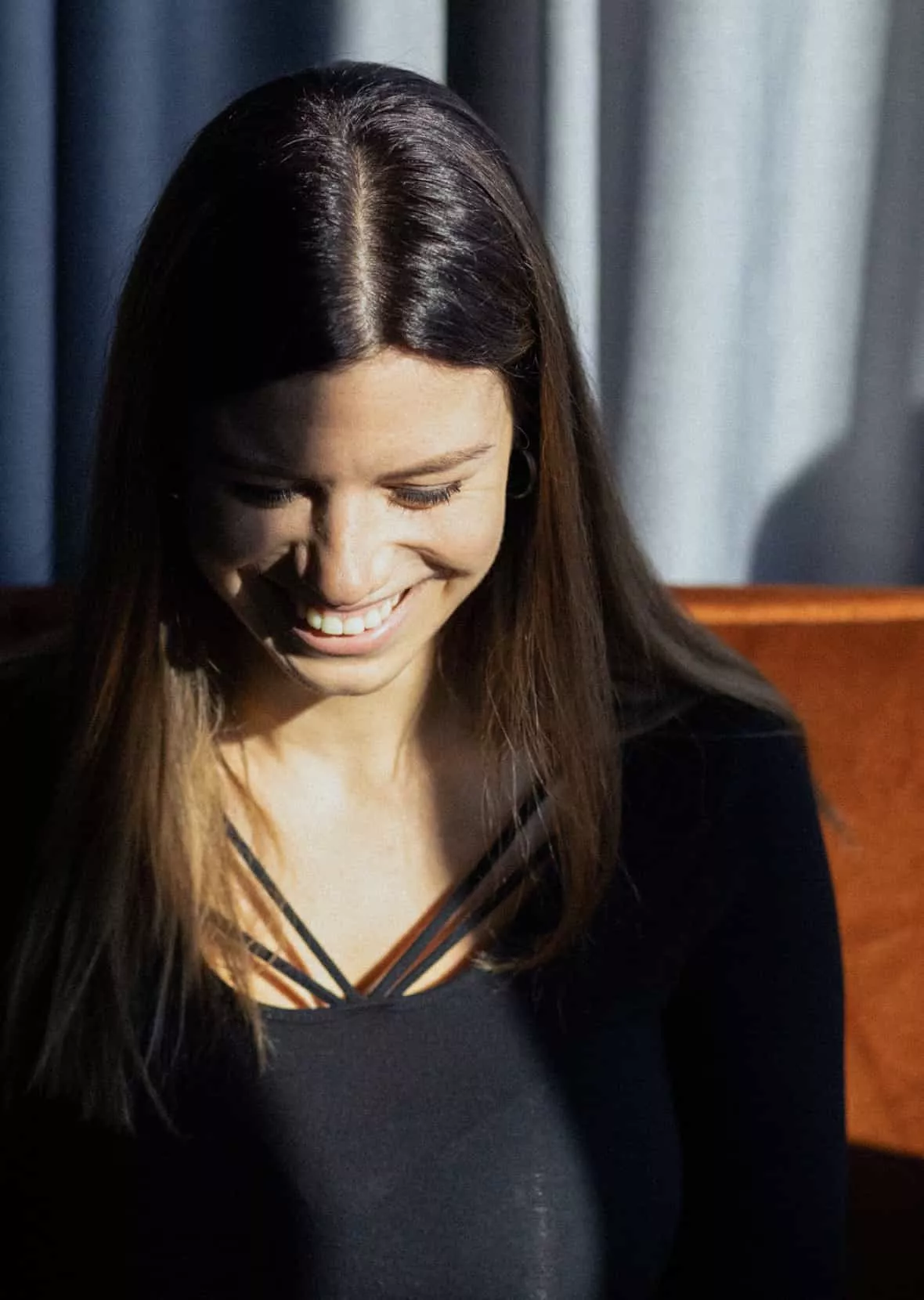
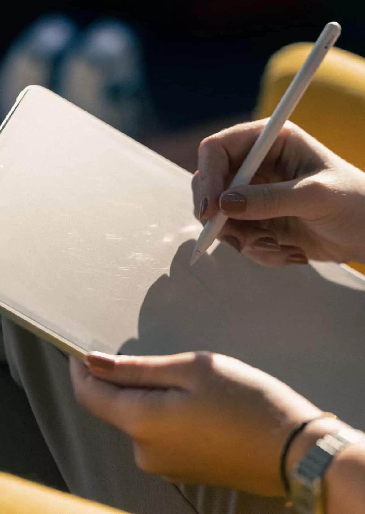
Photography
We mainly use two types of photos: portraits and office shots. Office photos have one or two people shown in their natural situation, or they show details from our office that allow more artistic freedom with the stylization of the shot. In portrait photos, we want to show our people in a relaxed, cheerful mood and preferably smiling.

Portraits
Models should avoid clothes with patterns, fluorescent colors, or entirely black apparel. Feel free to use red backdrops and red props.
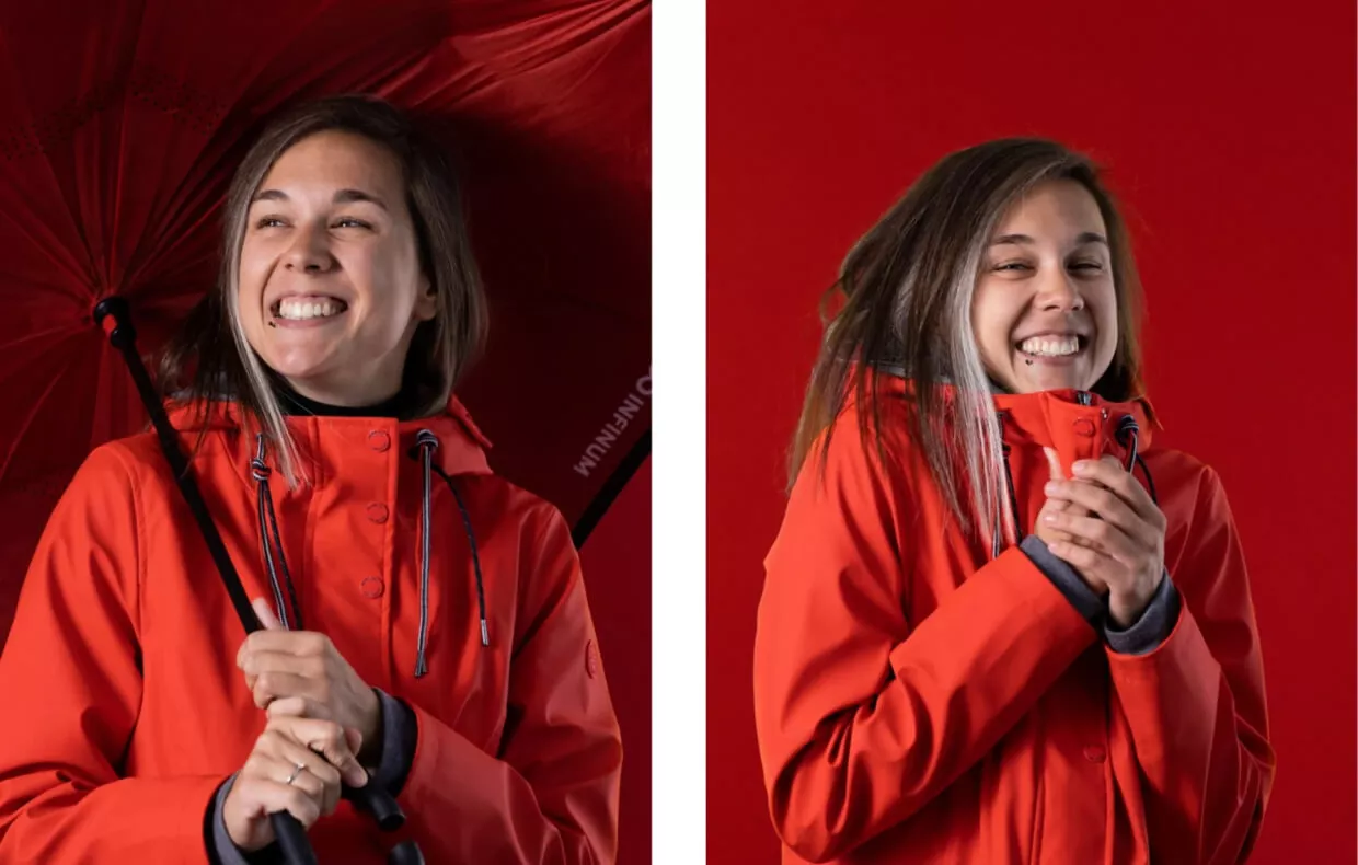
Portraits
Models should avoid clothes with patterns, fluorescent colors, or entirely black apparel. Feel free to use red backdrops and red props.


You can find our photography library here. This content is accessible to Infinum employees only.
Motion
The animated Infinum logo and the subtle background loops are the core elements of our motion design. For advanced video design, check out the guidelines for ease setup, intro & outro animations, cube & mask transitions for texts and images.
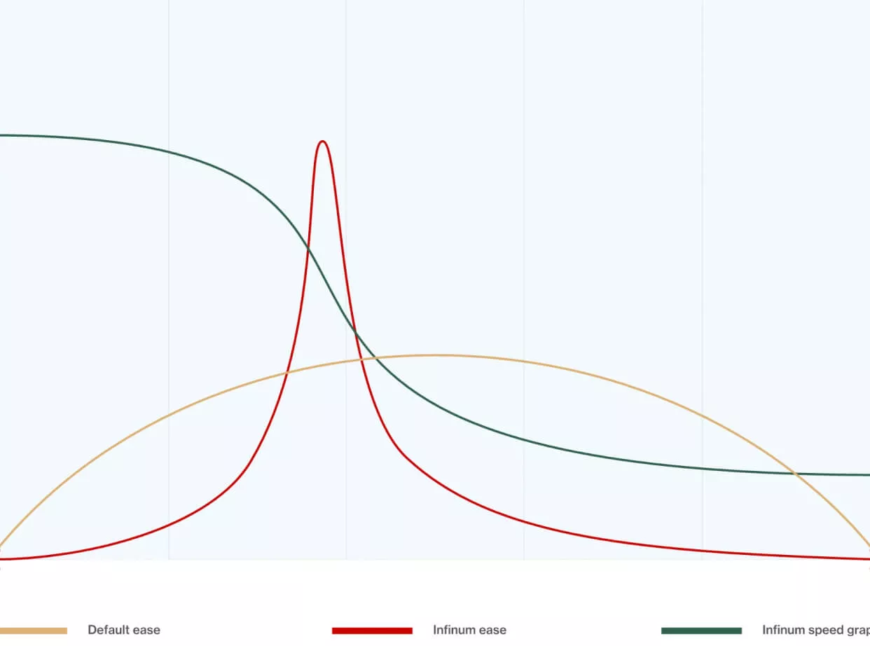
Ease
The graph shows the default ease-in & ease-out curves against the Infinum curves (value and speed graph).