


The year 2020 brought along many unprecedented events. The most awaited Friday of the year is no exception, as the digital revenue of Black Friday 2020 is predicted to reach unprecedented heights.
Due to the ongoing global pandemic and national lockdowns throughout the world, this year’s Black Friday will be a digital-first experience. If you’re an eCommerce owner, it’s smart to get your webshop affairs in order.
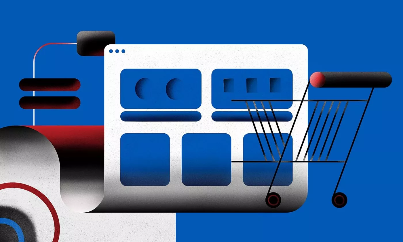
There is still time to get your eCommerce ready
With Black Friday around the corner, there is no time to waste, so let’s dive right into our list of 15 easy changes you can make to your webshop as soon as you finish reading this article. You won’t need a developer for most!

Product discovery and research stage: Ensure pleasant browsing
1. Curate your homepage
People love the impression of the variety of choices. On the other hand, having too many options makes choosing difficult, as confirmed by a famous jam study. The study showed that decreasing the number of options actually raises the number of purchases. Crazy but true.
2. Highlight promotions and special deals
Show people that they’re in the right place by showcasing special deals you’ve prepared for them. Even if they don’t bite into it, you’ve established that your webshop is a place that gives them value for money.
3. Make the search bar visible
Some people know what they’re looking for, so make it easier for them to find it. Intuitive categories in navigation are great, but nothing beats users being able to type in a search term themselves.
4. Help users with visual impairments
CDC reports that 21 million Americans have vision problems. Accessibility tweaks to your site won’t burn a hole in your budget and they’re the online equivalent of you holding the door for your customer. A bit of good manners goes a long way.
5. Set the free shipping threshold
Setting a threshold provides a frame for users’ purchases. Below that amount, going to the checkout will feel like giving away the money, so customers are inclined to add more items to the cart to avoid “unnecessary” cost.

Consideration stage: Simplify the selection and give recommendations
6. Add appealing visuals
Humans are visual beings. Good-quality photos will make it easier for website visitors to envision themselves using, wearing, or consuming your product. That’s bringing them one step closer to buying it.
7. Warn shoppers about low stock
Abundance doesn’t spring people into action. Seeing there are only a couple of pieces left of the timeless black dress will! Warn customers that they might miss out on something if they don’t put it into the cart soon.
8. Bundle with free items
Free and $0 have a unique appeal – not just when it comes to free shipping. A free additional item is a powerful nudge for making a purchase because it makes a good deal look even better. Use it strategically to boost the sale of products that bring you the most profit.
9. Round the price for emotional purchases
When the emotional aspect of the purchase is essential (think getting a perfume), don’t bother your customers with decimals in prices. Round it up! On the other hand, if a product requires planning and research before buying, make the price precise, e.g., $208,37.
10. Show similar or complementary items
Guide customers’ attention to what they might also find interesting in your shop. Such recommendations are valuable because they save users time and eliminate the need to study your whole stock. It’s all laid down in front of them. The easier, the better.

Purchasing stage: Facilitate the decision making
11. Allow guest checkout
Signing up is a hassle, and introducing hassles at the moment a visitor was about to become a customer is a dealbreaker. No brick-and-mortar store would stop the customer on their way to the cash register, right? Convert guest shoppers to registered ones with a well-placed follow-up email, not when they’re about to give you money.
12. Color the screen green
Digital is the extension of a real-life environment. What’s the usual color that means “stop”, and which one means “go”? If your branding allows it, make the checkout button green and avoid the color red. A simple but impactful nudge.
13. Reassure with a description and photos
You know your products by heart – your users don’t. “Handy Toolbox 23iX” means little without a photo and description, so show them in the cart to reassure users they’re buying the right items. Confusion might stop the almost-purchase in its tracks.
14. Be 100% transparent about costs
The checkout section should be as transparent as possible. Tell users how much they’re paying for your goods and services, the shipping cost, and what other fees they might need to pay. A snake oil salesman approach will surely backfire.
15. Add a final stop in the purchase journey
Steal another page from brick-and-mortar stores’ books by offering easy addition of tempting products at the checkout. These shouldn’t be too expensive but a little pleasure every customer can afford. Alternatively, it can be a product you can never have too much of, like socks, batteries, or USB cables. Ta-da, a simple end-game move to boost the average basket size.
Want more insights from successful brands?
The tips listed above are quick and easy modifications you can make to your website immediately. After the Black Friday madness dies down, think about implementing solutions that could help your eCommerce grow revenue all year round, not just the one Friday a year.