Creating a modular design system for a famed travel tech company

SITA
We designed a fully customizable flight booking system for airlines across the globe.
SERVICES
STRATEGY
DESIGN
PROJECT INFO
A frequent flight companion
SITA is one of the world’s oldest travel IT companies, providing services to over 400 airlines and affiliates worldwide. Their flagship product, the web-based flight search and reservation system Horizon, is used by companies across six continents, each with custom branding, language, cultural norms, and accessibility requirements.
Expanding the horizon
To stay competitive in an ever-demanding market and move away from legacy systems, SITA wanted to evolve Horizon into a flexible platform that would meet the needs of both their airline customers and end-users. Working closely with SITA’s stakeholders, we created a fully modular design system that not only meets their current requirements but is also extendable to new products and services.
Languages supported
16
Unique components created as part of design system
36
SITA’s airline customers using Horizon
130
A GROUNDING EXPERIENCE
A multi-faceted product for the airline industry
Developing a cohesive design system for a multi-faceted industry product requires agency and client to respond to multiple challenges at every turn.
Industry-inherent
challenges
Legacy systems
Backend systems built years ago are still widespread in the industry, despite losing their practical usability.
Rules
All processes are governed by complex business requirements based on an array of international rules and regulations.
Tight margins
Fierce competition in the industry and razor-thin profit margins require innovative ways of generating revenue.
SITA-specific
challenges
Multinational scale
Due to SITA’s many partners and products, our process included 34 direct stakeholders across six time zones – all with the ability to pull the brake handle.
Legacy design methods
Many of SITA’s products were launched before the widespread uptake of user-centered design practices. The interfaces had usability issues resulting from years of bolting new features and functionality onto legacy designs.
Horizon product line
challenges
Lack of flexibility
As with many of SITA’s other products up to this point, Horizon was built using a classic waterfall methodology.
Unmet user needs
The development practices employed resulted in a product that was misaligned with the needs of its user base.
Inability to update
Without the possibility to iterate quickly, releasing updates became difficult and time consuming, and the customers were kept waiting.
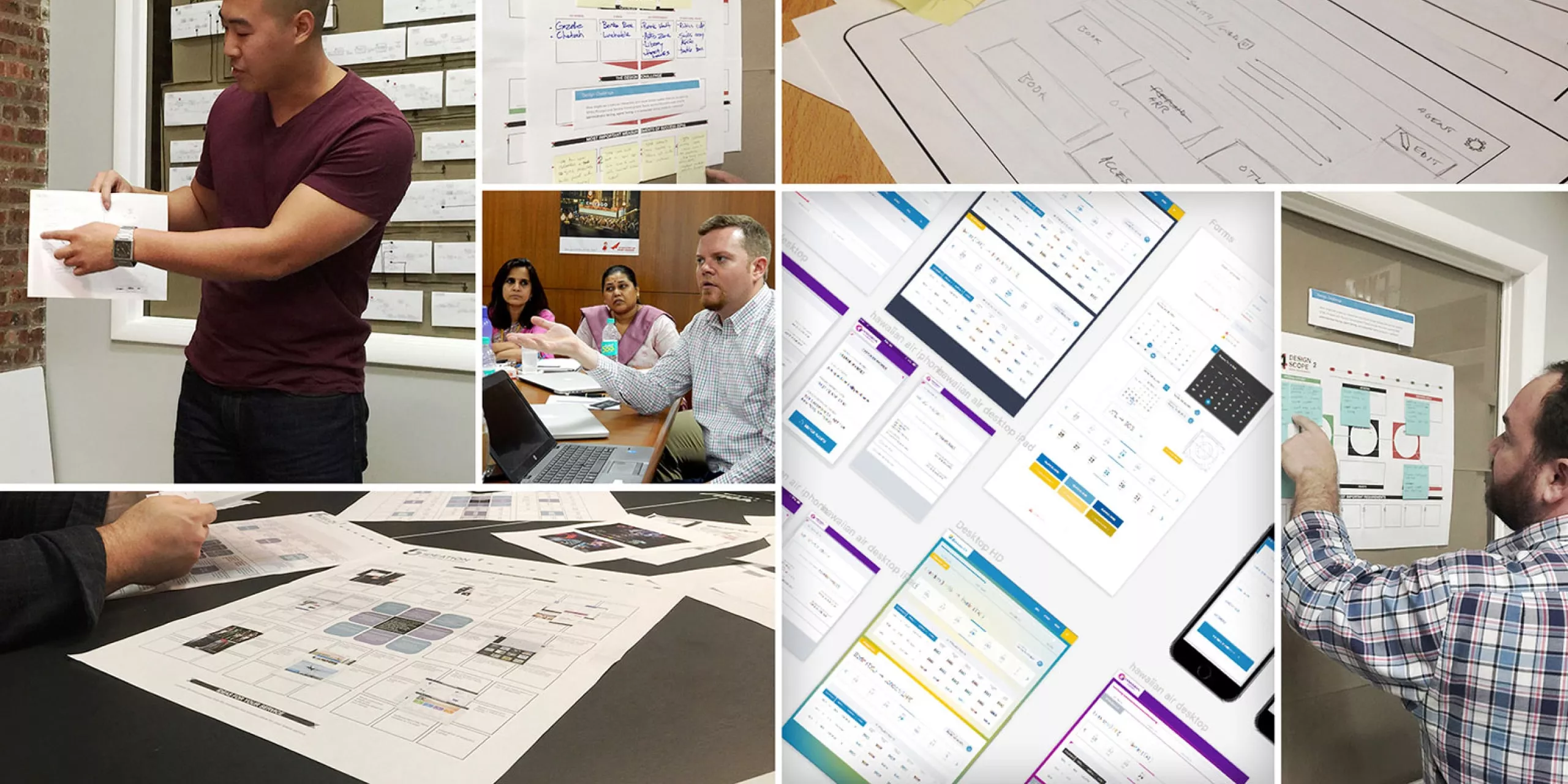
Building such a complex system with so many unique challenges required a massive discovery effort. We talked to nearly 40 stakeholders over eight weeks, performed heuristic analysis, competitive analysis, user research, and held “Airlines 101” sessions, all of which resulted in a detailed report containing the roadmap to creating the new product.
SITA was eager to adopt an Agile methodology, and the Horizon project was an ideal starting point.
Building the design system, we employed the user-centered, iterative cycle:
THE REQUIREMENTS
A chameleon platform to get all users aboard
A single platform had to serve both customers and ticketing agents, meeting the unique needs of both groups. At the same time, it had to be easily adaptable for any of 130 SITA’s airline clients on six continents.
User-focused
Customers needed a frictionless, simple user experience across a wide range of use-cases and within the confines of a massively complex business process. Agents needed to be able to conduct hundreds of bookings daily and quickly accommodate highly complex edge cases.
Customizable
The color scheme we defined would have to work across the full color wheel, allowing each carrier to apply their own branding with no unwelcome color clashing.
Localization-friendly
Any icons, microcopy, and messaging in the user interface had to be easily translatable across dozens of cultures and languages.
Accessibility-compliant
AA standard accessibility compliance was essential.
Performance-driven
Particular attention had to be paid to performance within a wide range of hardware, software, and internet connectivity and bandwidth conditions.
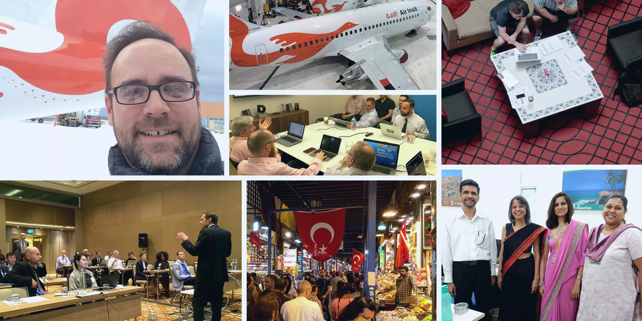
A global solution requires global research – we conducted extensive field studies, ideation workshops and usability tests with ticketing agents and airline stakeholders in the US, Canada, and India.
THE SOLUTION
Altitude, a single source of truth for all their design needs.
To provide the SITA team with everything they needed to apply the principles of user-centered design to the design system we developed for Horizon, we created Altitude – a single source of truth for all their design needs.
Thanks to Altitude, SITA was able to bring the design system in-house and continue to update Horizon after we finished our work on the project. It also laid the groundwork for applying the design system to other products in their portfolio, ultimately allowing the creation of a cohesive design system to be applied across the full suite of SITA products.
Included in Altitude
“Why-To” guidance illustrating design principles in practice, user-centered design best practices, error handling, and messaging.
“How-To” guidance including the usage of colors, type, icons, layout grid, and UI elements
HTML, CSS, and JS markup for all commonly used UI components
The team brought how the consumer FEELS front and centre in UX design, and this is something that became ingrained.
SENIOR DIGITAL PRODUCT MANAGER,
SITA
SITA immediately adopted, and continues to evolve Altitude, along with its design principles company-wide. Setting a new course – forward, they immediately started onboarding their customers to the newly designed Horizon platforms.
This project was executed by our US team, formerly known as ETR. The company was acquired by Infinum in 2023.


