


An exceptional healthcare organization gets a website to match

COMMONWEALTH CARE ALLIANCE
We built a modern, scalable website to support CCA’s nationwide expansion and reflect their high standard of care.
SERVICES
STRATEGY
UI DESIGN
UX DESIGN
WEB DEVELOPMENT
PROJECT INFO
Enhancing an award-winning organization’s digital presence
Commonwealth Care Alliance (CCA) is an award-winning healthcare organization serving Massachusetts residents with complex needs. They reached out to us on a recommendation of another client (the kind of referral we love to get and never take for granted) because they were ready to expand their service offering outside of Massachusetts, and it was time to bring their digital presence up to the same high-quality standard as their care.
We guided the CCA team through our Purpose-Driven Design process, and together we set about building a modern, scalable website.
Increase in users
110%
Increase in sessions
84%
Organic search increase
87%
Creating a canvas for success
We began our partnership with one of our favorites called a Context Canvas. In this kickoff activity, our teams met each other and got right into a collaborative design exercise.
We worked together to populate the canvas, clarifying the goals of the project, identifying who we were designing for and their needs, documenting the website differentiators, and defining what success would mean. By kicking off the project with this exercise, we were able to all get aligned on the big picture and goals of this effort.

For the next few weeks, we dug into discovery — interviewing stakeholders, health plan members, and health care providers in order to truly understand their needs and challenges when it came to the website.
We also conducted a competitor analysis, an SEO audit, and a content audit to get a full view of the existing site and the landscape of the industry. We learned from our interviews that internal teammates and members alike thought that CCA was a unique example of excellence in health care, but the website didn’t reflect that in its messaging and design.
Additionally, CCA staff wrote informative and interesting content for their members, but it was only available in print form, since there was no intuitive place to put this on the website, and many members were missing it.
We also learned that scalability and accessibility were top of mind for a lot of stakeholders; CCA had plans for expansion and they wanted to make sure they were providing current and future members with an optimal experience that would not cause them headaches to manage.
Using data to untangle website navigation
After gaining context from our interviews, we moved on to other types of research to further inform our design decisions. Two methods we used for this were tree testing (asking users to find things using a site’s basic organizational structure and terminology) and an in-situ website survey.
We knew going into tree testing that CCA had a bit of untangling to do with the website’s navigation. Members had remarked that getting around the site was difficult, and the hierarchy that differentiated one health plan from another was not clear. Before jumping into a navigation redesign, we conducted tree testing with members and providers on the existing website to understand where users were getting tripped up. We realized through testing that some of the language used on the site could be contributing to confusion, such as using the term “formulary” when “covered drugs” might be clearer.
Knowing that navigation was a challenge for members, and that CCA’s audience often included people who may have visual or comprehension impairments, we decided to create a unique navigation design tailored to these needs.
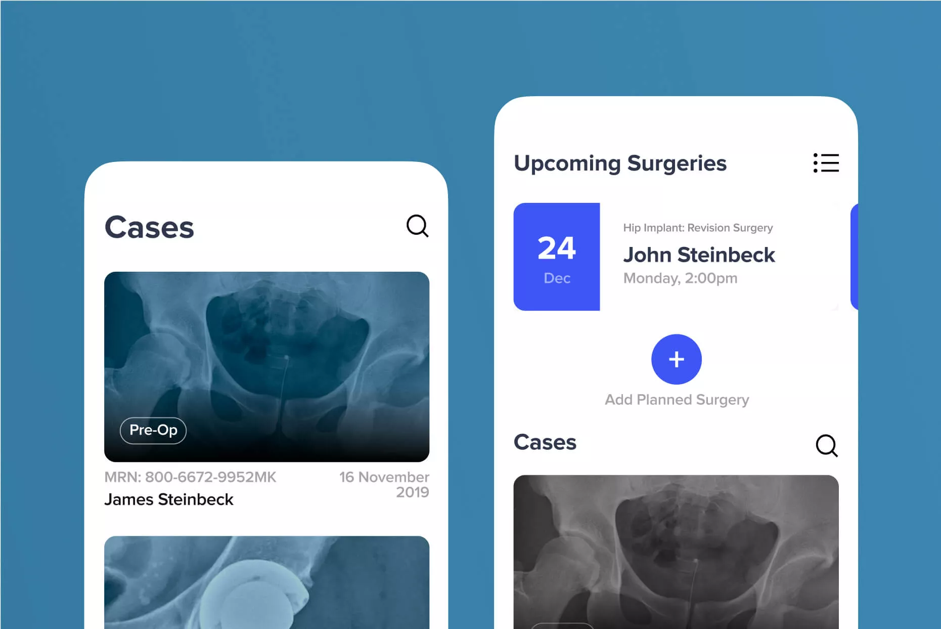
We devised a navigation structure that guided members through the experience with iconography and easy-to-understand hierarchy which highlighted the top tasks relevant to the page.
Usability testing on this design showed that members could navigate much more easily, and that the design seemed more friendly and intuitive.

Modernizing the brand
Next came the visual design for the site. CCA had established colors, fonts, and iconography, but the brand needed a refresh. We were able to take these important brand elements and elevate them, while still keeping the look and feel familiar to members and staff.
We enhanced their typography by evolving the brand font from Helvetica to Helvetica Now, a new take on the typeface that prioritized digital legibility and accessibility. We devised a system for using their existing brand colors to distinguish different plans without overloading the site with too many color variations.
We also designed an extensive icon library to help convey the sometimes complex world of healthcare in a simple format. All and all, we made a lot of substantial improvements to the CCA brand while still maintaining the brand’s integrity and familiarity.

Planning ahead with a multi-site structure
When we began working with CCA, expansion was at the forefront of the team’s minds. We needed to create a modern, easy-to-update site that could also scale. In order to accomplish this, we created a WordPress Multisite. (Multisite is a WordPress feature that allows you to manage multiple websites from a single WordPress installation.)
CCA needed an easy way to deploy new state sites as they became available. We used WordPress Multisite to enable them to spin up new state sites with ease.
Another benefit of this setup was document management. We created ways for the team to easily pull content into the state sites from the main site hub to create a centralized place to manage important documents and avoid duplication. This setup made website management easier and more intuitive for staff to maintain.
Prioritizing accessibility
As a healthcare organization serving people with complex needs, accessibility was a top priority for CCA. Equitable access is built into their ethos, and as an organization that works with Medicare, they are required to meet accessibility laws such as Section 503 of the Rehabilitation Act and ADA.
Our team worked with CCA to ensure that designs were compliant from the beginning, as well as developed in an accessible way. When the new site was ready to launch, we conducted a thorough accessibility audit by hand using a screen reader and keyboard, identifying and mitigating any remaining issues.
Results so far
CCA began to see the positive impact almost immediately upon launch. Bounce rate decreased by 28% and download activity increased sharply – concrete signs that the new experience was easier to use and engage with.
Comparing analytics from Oct. ‘20–Oct. ’21 to the time period covering Oct. ‘22–Oct. ‘23, organic traffic increased by almost 90%, users grew by 110%, and page views were up by 85%. In addition, CCA’s internal teams have reported an easier-to-use CMS and the time-to-market for subsequent state sites sped up markedly.
An ongoing partnership
Since launching the new site in 2021, CCA has continued to expand and change their organization, and we’ve been there every step of the way. When we began our partnership, CCA was just beginning to build out their design maturity. With our support, they have increased their internal team’s understanding of UX best practices and onboarded new team members with a goal of delivering a great experience to their customers.
We remain a strategic agency partner of CCA’s, providing insights, design, and development solutions where needed as they continue to improve their brand. We’re proud of all we’ve been able to accomplish together and look forward to the future!
This project was executed by our US team, formerly known as ETR. The company was acquired by Infinum in 2023.