Evolving a successful workout brand
THE CLASS
We built a bespoke platform that transforms an immersive, community-driven workout into an intuitive digital experience.
SERVICES
STRATEGY
UX DESIGN
UI DESIGN
VISUAL DESIGN
WEB DEVELOPMENT
VIDEO-ON-DEMAND
PROJECT INFO
Taking movement and mindfulness online
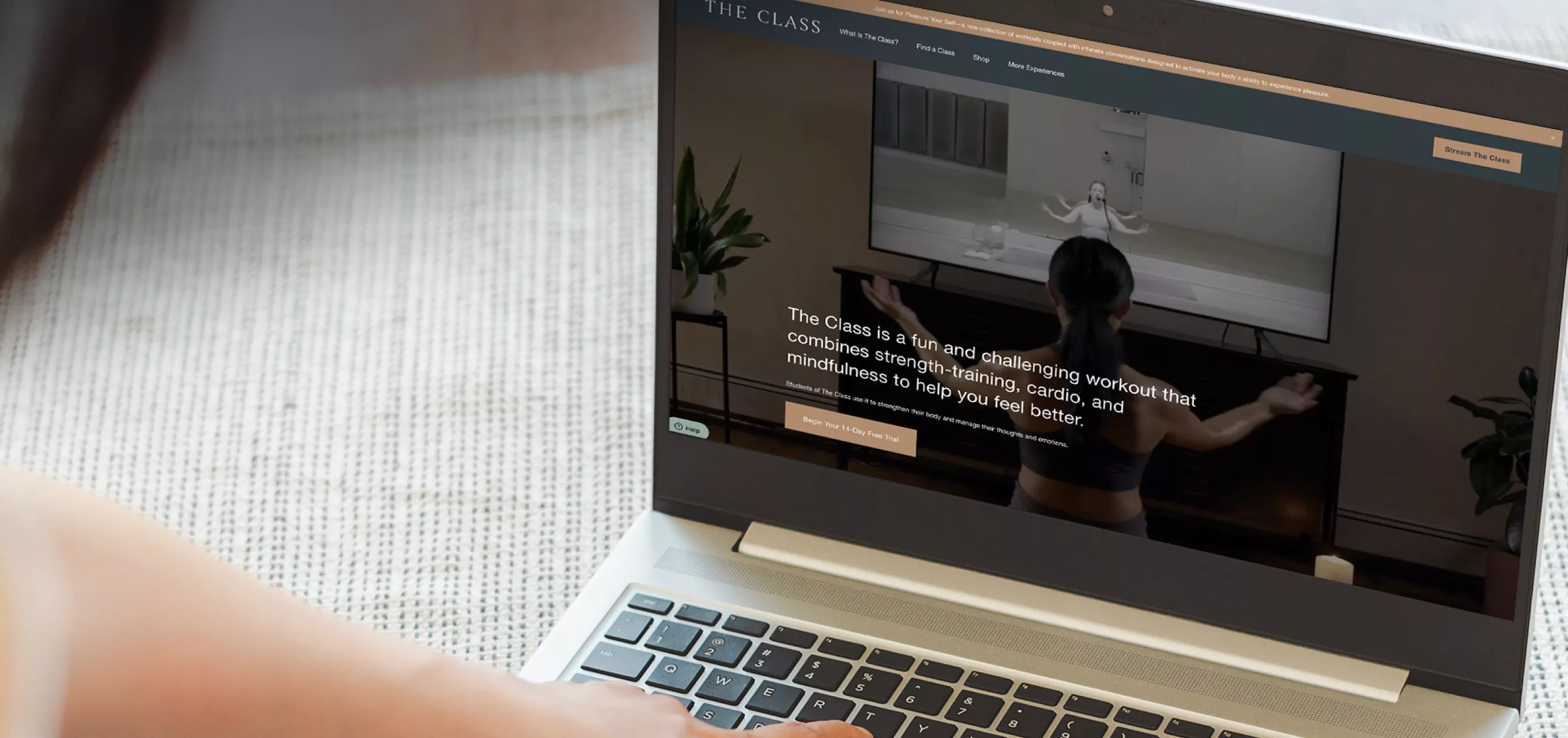
The Class is an innovative workout that combines strength, cardio, and mindfulness to help you feel better. When the pandemic hit, they had to find a way to translate the atmosphere and experience of their community into a digital landscape. We stepped in to make it happen.
New features designed
30+
Rounds of usability testing
4
New product lines added
2
Substantial decrease in user churn over the past 12 months
12
“The Class needed help reimagining our platform from the ground up and solving complex subscription video-on-demand challenges. Over the course of several months the team embedded themselves deeply in those challenges and worked closely with us to deliver an outcome that has yielded impressive results.”
PHASE 1
UX research and recommendations on how to improve the existing product
We began working with The Class in the winter of 2021, right as the world was entering its second year of the pandemic. Exercise habits had changed dramatically due to social distancing and gym closures, which pushed The Class to consider how to translate its offering online.
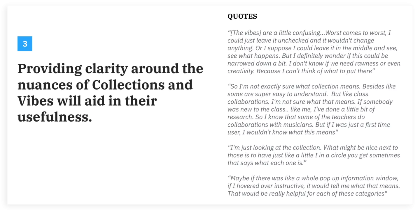
But what exactly is The Class? What we found in talking to their students is that it’s not an easy experience to describe. Many said to truly get it, you’d have to try it. While there can be benefits to a brand having mystery, that same ambiguity can cloud and overcomplicate an online presence. Piquing someone’s curiosity without giving too much away is a slippery slope that can often lead to visitors abandoning a website instead. Our first task was doing some UX auditing and research with existing customers as well as those who didn’t know what The Class was to find that perfect balance.
We spoke to 10 prospective audience members (those who are not yet members of The Class but fit the demographic) and four current members. In addition to an interview, we also had participants participate in a usability test of the current website.
Through our research we sought to answer these questions:
Prospects
- What are their first impressions of The Class?
- What do they think of The Class concept? Is this something they would try?
- What questions do they have?
- Are they able to find the answers to these questions? What’s confusing?
- Do they understand the navigation of the existing website? Where are they getting stuck?
- What aspects of an exercise class experience are most important to them?
- How can we convince exercise-minded individuals to try The Class without alienating the existing students?
Students
- What is their experience like with The Class and the website today?
- What questions and concerns did they have when they were new to The Class? How did they find their answers?
- What do they visit the website for?
- What do they wish was different?
- After our interviews and testing, we compiled our insights into a research report that laid out the issues we found and a path forward to correct them.

PHASE 2
Small, incremental feature upgrades and testing with users
Next, we moved on from the marketing site to the product. We started with researching and upgrading the design of a core part of the experience — finding a class. After working with the client to design a prototype of an upgraded filter and search experience, we conducted usability testing with real members to see how it performed. Again we did a combination interview and usability test. We first learned about the participant’s habits, needs, and current experience, and then we dove into the prototype and watched how they interacted with it.
In this research sprint we prioritized speed and validating our ideas quickly. We tested with just five users in the first iteration, but we gained valuable insights we wouldn’t have realized on our own. For example, we learned that making small language tweaks would make a big difference in understanding how a filter worked as well as make the experience feel more inclusive. From this quick research sprint we were able to come up with a list of action items to make improvements to our design.
PHASE 3
Feature prioritization, concepting, and development of an entirely new platform
The Class’s digital experience at this point had been supported using Vimeo’s API. Our development team had been jumping through hoops to get Vimeo’s framework to cooperate with the unique features The Class team wanted to accomplish. But The Class team had even greater ambitions, and it was becoming obvious that Vimeo just wouldn’t be able to make it all possible. Enter our next challenge: create a new, bespoke platform for The Class to live on from the ground up.
Our development team worked in close collaboration with The Class’s lead developer to build this new platform. We utilized a hybrid approach to building the web and mobile apps, sharing many components from the same codebase. This allowed us to save time and keep the UI and experience consistent across all platforms. In addition, we took the lead on developing a native TvOS app and Roku TV to extend the reach of the new platform to more audiences.
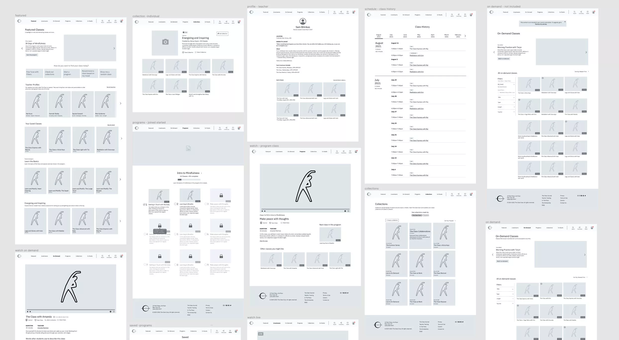
The Class team had no shortage of good ideas for their product’s evolution, but now it was time to prioritize. Using the knowledge we gained from previous research, we were able to prioritize feature ideas based on things we knew to be important to The Class students. We created a project roadmap, front-loading the features that provided the greatest value with the lower levels of UX and dev work needed, and got to work.
Translating a physical space to digital design
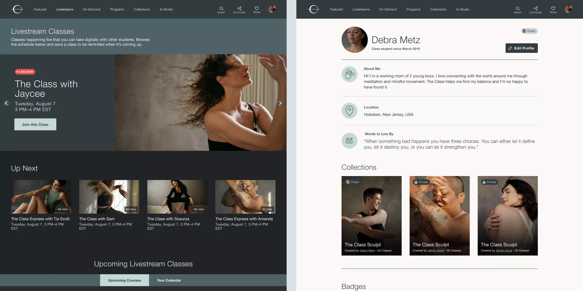
The Class studio in New York City is an experience. When you walk into the lobby, the lighting is dim and the space is mysterious. But when it’s time for Class, you enter an open space filled with natural light and bouncy sprung flooring. This effect of opening up and becoming lighter is very intentional.
So the challenge was for our visual design team to translate that to a digital space. The visual design is simple and soothing, utilizing light and dark palettes intentionally. Colors like fog, sand, and sage wash over the user as they navigate. We worked hard to make sure this digital space felt on brand for The Class, and that the typography, imagery, graphics, and colors all worked together to make the online experience feel just as special as in person.
Expanding the product offering
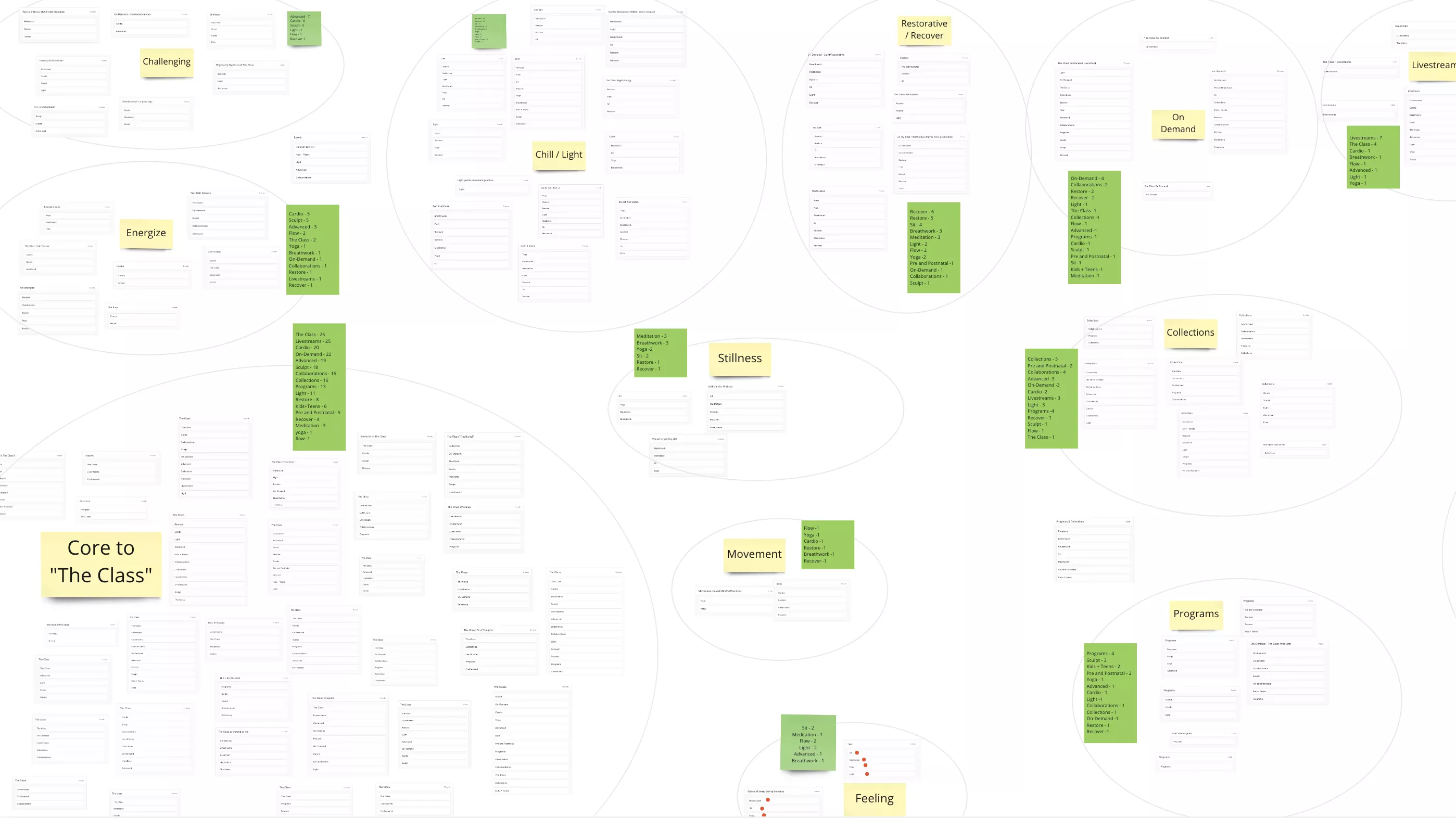
After a successful relaunch of their platform, The Class’s newest challenge involved how to expand their offering to include yoga and meditation. We conducted several rounds of testing to understand things like their audience’s opinion on these changes, the right language to use, and how to structure the navigation. Because of the testing we were able to ensure that the updates were not a jarring change to users but a welcome one.
One member put it perfectly:
I love how The Class continues to evolve. Love the yoga classes to the point where I dropped my other online membership. Thank you for listening to us and evolving with the times!
An ongoing partnership
Like many of our clients, The Class was very happy with the results of our collaboration and has kept us as an ongoing partner. We continue to provide UX and development guidance to their evolving and growing platform, and we look forward to the future innovations we’ll get to work together on.
This project was executed by our US team, formerly known as ETR. The company was acquired by Infinum in 2023.
