UI & UX - Android
Last modified on Wed 06 Jul 2022
You can't use up creativity. The more you use, the more you have.
Material Design is an open - source design system created by Google and used for creating Android apps UI that is usable and beautiful. Material Components are interactive building blocks for creating a user interface.
Bars
| Element name | Definiton / Picture / GIF |
|---|---|
| Bottom Bar | 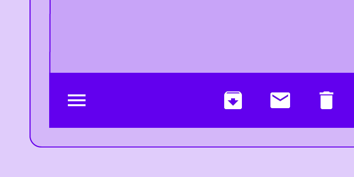 A bottom app bar displays navigation and key actions at the bottom of mobile screens. A bottom app bar displays navigation and key actions at the bottom of mobile screens. |
| Bottom Navigation | 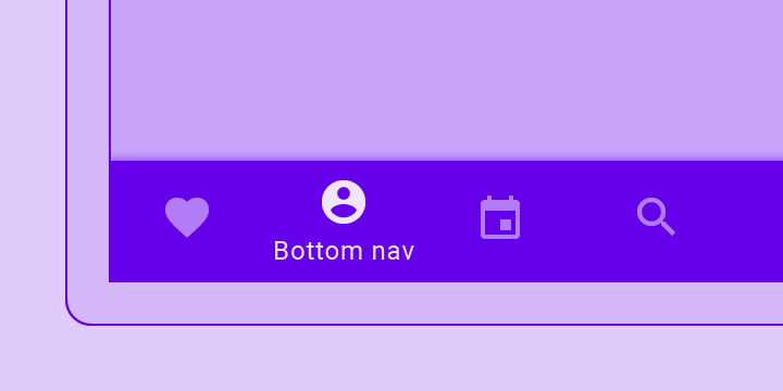 Bottom navigation bars allow movement between primary destinations in an app. Bottom navigation bars allow movement between primary destinations in an app. |
| Tabs | 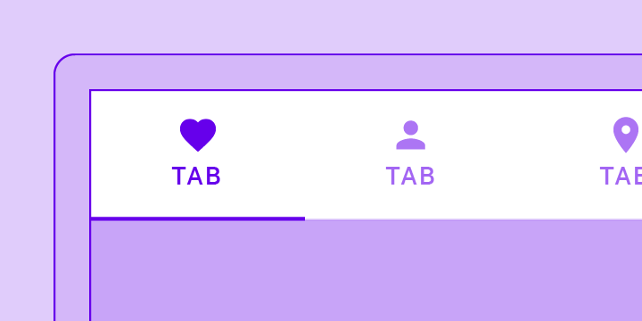 Tabs organize content across different screens, data sets, and other interactions. Tabs organize content across different screens, data sets, and other interactions. |
| Top Bar | 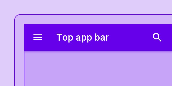 The top app bar displays information and actions relating to the current screen. The top app bar displays information and actions relating to the current screen. |
Buttons
| Element name | Definiton / Picture / GIF |
|---|---|
| Floating Action Button (FAB) | 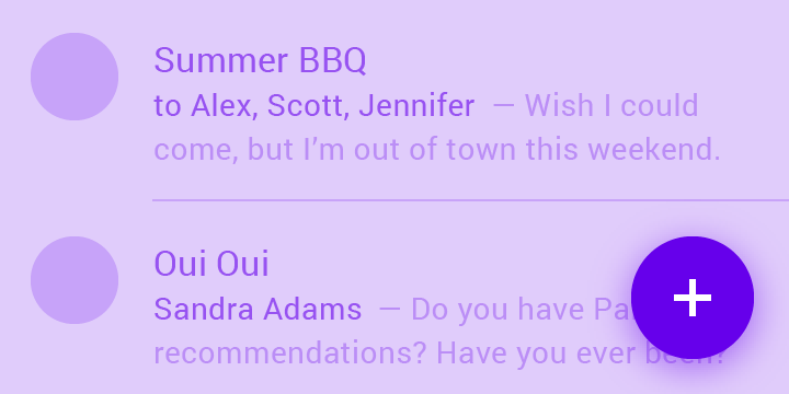 A floating action button (FAB) represents the primary action of a screen. A floating action button (FAB) represents the primary action of a screen. |
Misc
| Element name | Definiton / Picture / GIF |
|---|---|
| Backdrop | 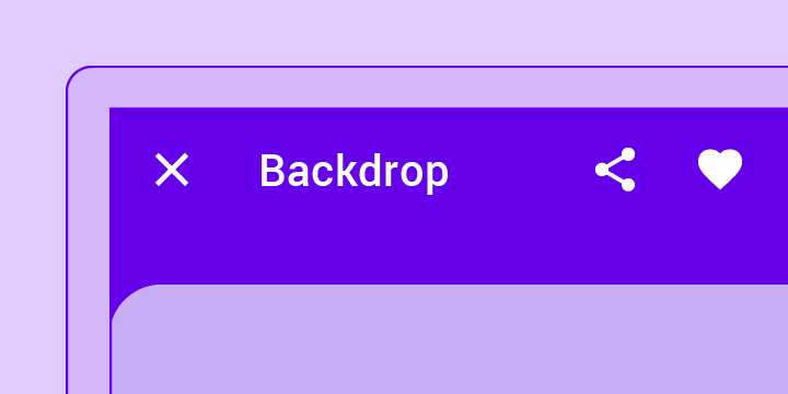 A backdrop appears behind all other surfaces in an app, displaying contextual and actionable content. A backdrop appears behind all other surfaces in an app, displaying contextual and actionable content. |
| Banner | 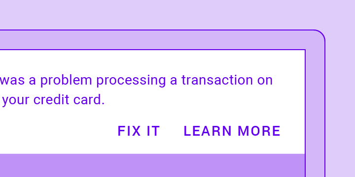 A banner displays a prominent message and related optional actions. A banner displays a prominent message and related optional actions. |
| Card | 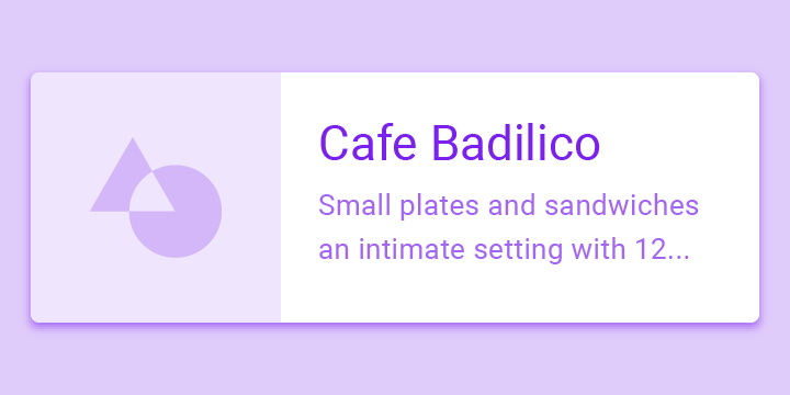 Cards contain content and actions about a single subject. Cards contain content and actions about a single subject. |
| Chips | 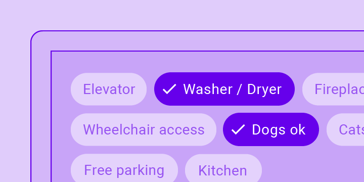 Chips are compact elements that represent an input, attribute, or action. Chips are compact elements that represent an input, attribute, or action. |
| Dialog | 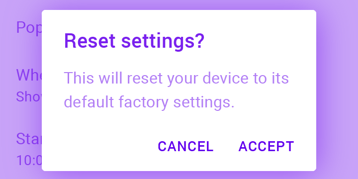 Dialogs inform users about a task and can contain critical information, require decisions, or involve multiple tasks. Dialogs inform users about a task and can contain critical information, require decisions, or involve multiple tasks. |
| Divider | 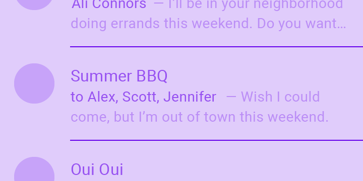 A divider is a thin line that groups content in lists and layouts. A divider is a thin line that groups content in lists and layouts. |
| Image List | 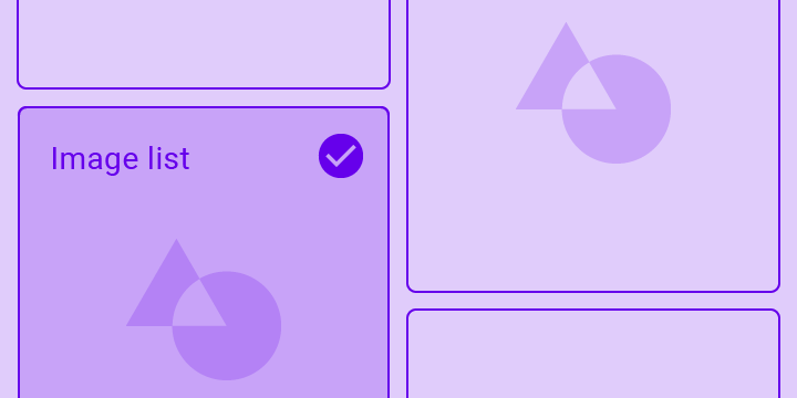 Image lists display a collection of images in an organized grid. Image lists display a collection of images in an organized grid. |
| List | 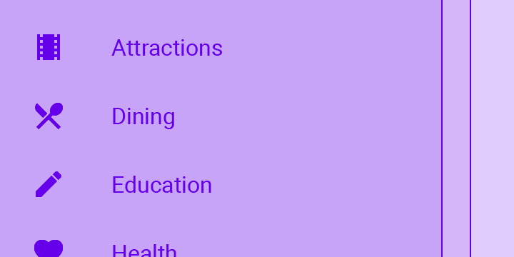 Lists are continuous, vertical indexes of text or images. Lists are continuous, vertical indexes of text or images. |
| Snackbar | 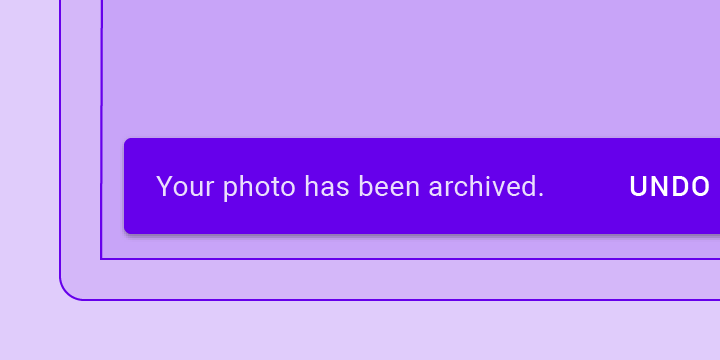 Snackbars provide brief messages about app processes at the bottom of the screen. Snackbars provide brief messages about app processes at the bottom of the screen. |
| Tooltip | 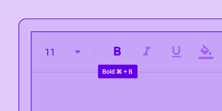 Tooltips display informative text when users hover over, focus on, or tap an element. Tooltips display informative text when users hover over, focus on, or tap an element. |
You can find more on Material.io.