


Have you ever visited an online store and added items to the shopping cart just to abandon it and never come back again? We bet you have because the average cart abandonment rate is nearly 70%.
As an eCommerce business, the best way to improve conversion rates is to make checkout experience easy and effortless.
Why checkout matters in the first place?
Checkout process is the critical part of any purchasing experience. When you consider the effort you have to put in to get people to your product pages, you do not want the conversion to fail because the checkout process was confusing or it included unnecessary steps.
A report from National Retail Federation revealed that 97% of consumers have terminated a purchase because the service wasn’t convenient enough. The good news is that checkout optimization that addresses the usual complaints can increase conversions by 35%.
Improve the checkout experience in 9 simple steps
- 1. Design a highly visible CTA button
- 2. Give a clear overview of important product details
- 3. Keep the checkout process transparent
- 4. Explain the shipping timeline
- 5. Simplify the payment form
- 6. Enable guest checkout
- 7. Make it easy to come back and complete the purchase
- 8. Ensure cross-device functionality
- 9. Eliminate distractions from the checkout process
How you approach checkout optimization can make or break your online business, so you should follow the best practices used by most popular eCommerce stores. Let’s check out nine simple improvements you can implement to optimize your checkout experience and increase sales.
1. Design a highly visible CTA button
Let’s start with the most obvious things. The checkout process begins as soon as the item is added to the shopping basket. Therefore, you ought to encourage website visitors to add products to the cart using a highly visible button.
It should be a bit larger/brighter/more colorful than other elements on the product page. ECommerce CTAs are simple and straightforward as all it takes is to create the “Add to Cart” sign (like you can see on the examples of Amazon product pages below).

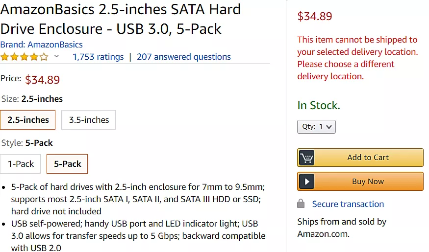
If website visitors have to search for the button to add the item to cart or for the button to start the checkout process, your design team has failed you.
2. Give a clear overview of important product details
Once the customer chooses a product, they should be given a clear overview of the selected item before proceeding to the checkout. This means displaying basic information such as the number of items selected, dimensions, colors, and other important details for that particular item.
Take Nordstrom for example – they immediately display the image of the product, its size, colors, and the price. When customers see that everything is fine with the ordered item, they can click the “Checkout” button and proceed to complete the purchase.

3. Keep the checkout process transparent
In order to maximize conversion rates, eCommerce businesses must keep the checkout process fully transparent. According to the research by Ready Cloud, more than 60% of online shoppers report leaving a transaction due to an extra cost (that most often appear in the form of shipping fees).
Online retail lives and breathes transparency. It is highly recommended to clearly state even the smallest details and eliminate any hidden fees all the way through the checkout line. The same goes for return policies, money-back guarantees, etc.
4. Explain the shipping timeline
Uncertainty is another thing online buyers hate and it could seriously deteriorate the conversion potential of your online shop. Don’t leave the customers wondering about shipping details, but rather explain the options and let them choose by their preferences.
Which shipping options you have and what is their respective price and delivery date? What kind of package tracking options you offer? What is your return policy? Do you deliver to specific countries?
First-time buyers will be hesitant to buy from you if they can’t find clear answers to all of those questions.
5. Simplify the payment form
This is the step that will have the highest impact on your conversion rate so it is definitely something you want to get right.
Common practice is that the payment form always comes in the latter stages of the checkout process. Setting aside that is the most intuitive approach, the idea is that potential buyers will be less likely to abandon the cart after going through all of the previous steps (adding things to the cart, reviewing items in the cart, choosing payment and shipping options, leaving shipping information).
Diversify payment methods
These days, customers expect having multiple payment methods. Although it depends on your financial management strategy, it’s good to add all of the major payment providers to the eCommerce store – PayPal, MasterCard, Visa, Stripe. Paying on the receipt of the product is still a popular option that shouldn’t be overlooked. Paying with a digital currency like BitCoin can be an interesting additional option, but it probably makes more sense for stores that sell computer hardware and similar tech.
Apart from that, online retailers are expected to ask for essential information only. First of all, it will speed up the checkout and make it more convenient. Secondly, it will protect users’ privacy, which has become quite a big deal with GDPR and all of the recent hacking incidents where millions of users had the personal data compromised.
Bellroy gives us a fine example of a simple checkout as it only asks for the fundamentals, which enable them to have the whole payment form on a single page.

If the payment form spans several pages, a good practice is to visually show the buyer at which step they currently are and what are the total numbers of steps left.
6. Enable guest checkout
Online retail businesses that force customers to register see a much lower conversion rate than those with guest checkouts. According to this report from Baymard, almost 30% of potential buyers quit the checkout process because the store forces them to create an account.
The point is clear – mandatory registration is causing the so-called “new account fatigue” and chasing away potential shoppers. Although it could sometimes undermine your upsell or cross-sell activities, guest checkout seems like the way to go in modern retail, with the possible exception of stores that only sell high-ticket items.
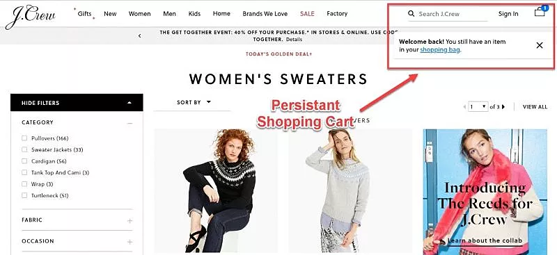
7. Make it easy to come back and complete the purchase
No matter how hard you try, the majority of visitors will end up abandoning the cart without completing the purchase. Your job is to make it easy to come back and buy items left in the shopping basket.
For instance, you can save cart content for later and help customers complete the transaction at more convenient time for them. This is a neat tactic to win over the customers even if they initially abandoned the checkout before registering. J’Crew takes this to heart and even shows returning visitors notification that they have left some items in the cart.
One interesting way to improve the checkout process for repeat customers is to save their credit card information (you can ask them during the first purchase if they want you to remember their credit card info). If you do so, recurring buyers do not have to enter that information on any of the following purchases, speeding up their shopping experience.
Additionally, you could also enable writing suggestions or use techniques such as auto-formatting or copy-and-paste to ensure effortless fill-ins upon return.
8. Ensure cross-device functionality
ECommerce stores should be optimized for cross-device browsing. Today’s buyers surf the Internet on multiple devices and they frequently switch between laptops, tablets, and smartphones. It forces webshops to take care of interoperability, especially because mobile shopping will make well above 70% of the global eCommerce sales by 2021.
9. Eliminate distractions from the checkout process
Finally, to ensure a smooth and effective checkout process, you need to eliminate unnecessary distractions. Minimalism is the name of the game here since shoppers only need to see the most important checkout details. That includes order reviews, shipping instructions, and payment details exclusively. Common checkout distractions include things such as multiple CTA buttons, distracting layouts, any kind of pop-up offer, forms with too many input fields, and similar.
Increase your chance of conversion by 35%
Checkout optimization is the cornerstone of digital retail, but it demands a detail-oriented plan of action that promises to raise conversions in the long run.
Simplifying customer experiences is the only way to keep the store profitable.